pollen app developer
Branding
The Fueled team worked extensively with our client to find a mark that echoed the Pollen brand. Through experimentation in the early stages we’re able to target a true representation of our clients’ vision.
Final Logo
Our final result positions Pollen as clean high quality brand. As a mark it’s as strong being standalone icon as it is the word mark.
Softer terminals
Rounding off the corners compliments the curves and angles of the typeface, making the Pollen brand unique.
Offset glyphs
Offsetting the positioning of the middle characters creates a striking arrangement, making the Pollen brand more recogniseable.
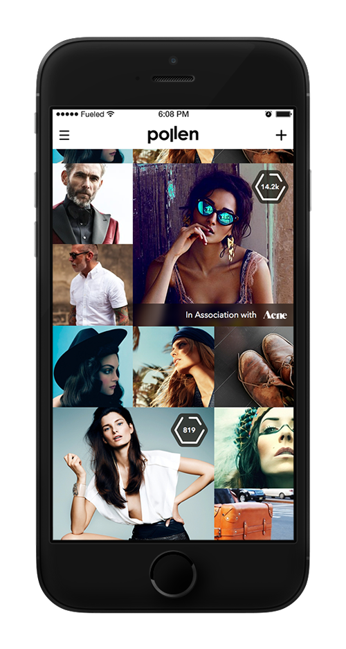
From UX to Design
Focus on creating and experiencing content that matters to our users. Whether it be driven by film, music, entertainment or art, our primary goal was to create a product that gives people the ability to showcase their lives in an new and exciting way. By removing everything that isn’t needed we’ve created a great product with a truly effective experience.
Navigation
Highlighting only necessary functionality.
Brand Awareness
Enhancing the experience with tailored brands.
Hierarchy of Info
Surfacing effective information with an unintrusive structure.
Bringing it to life
At the heart of Pollen is design, in the product itself and in the service it’s providing for our users.
Injecting character while allowing the content to be the primary focus not only allows our users to connect with the product in their hands, but also with the Pollen community as a whole.