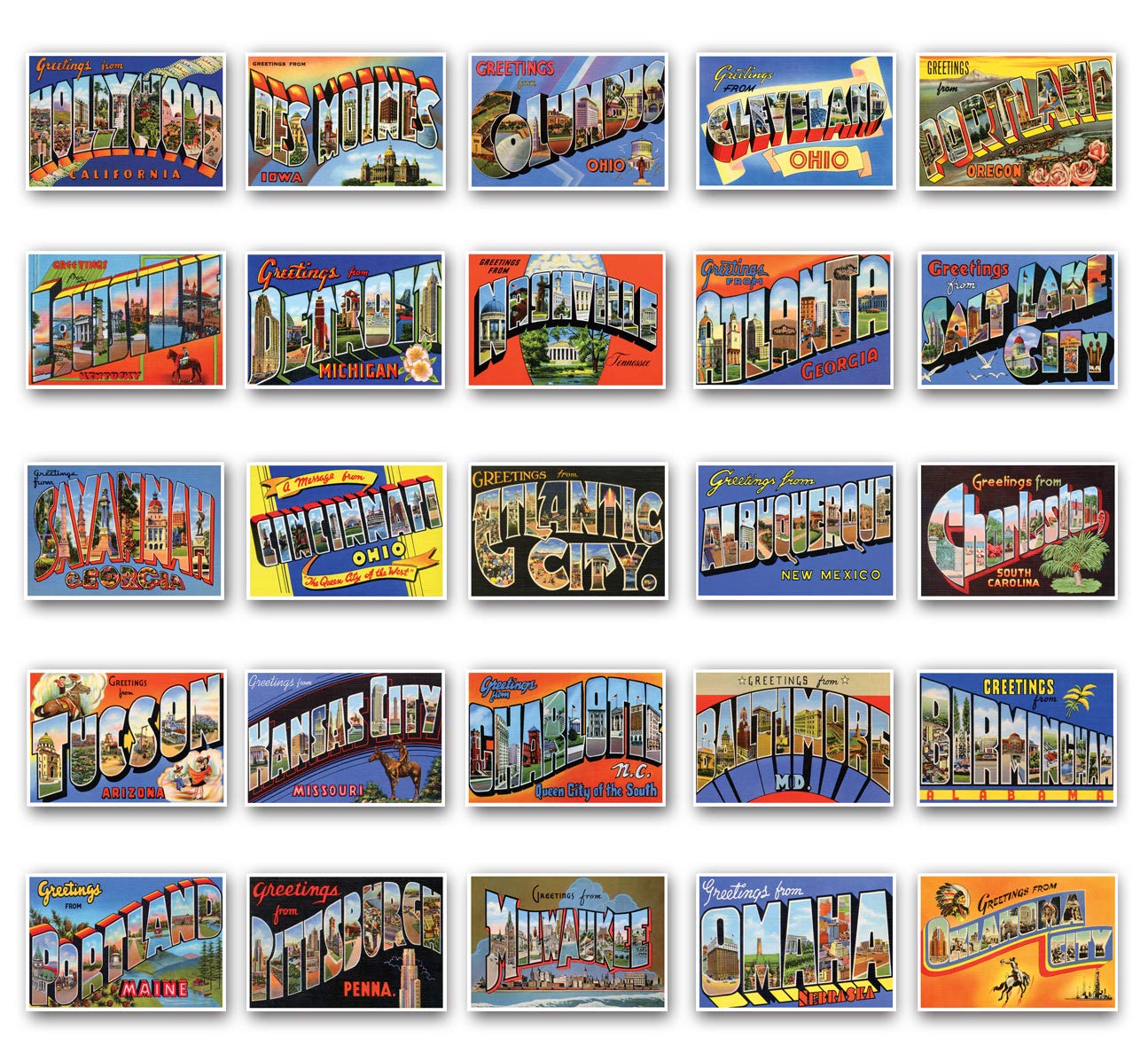
At Fueled, our top-notch design team task themselves with a bi-monthly design challenge. The task at hand is fairly simple; we take a brief from a pool of suggestions and smash out a solution in 2 hours. However, there are no winners in the design challenge. Taking a break from projects for a little while proves invaluable to us to share our ideas, explore our processes, and grow as designers. This week’s challenge came from yours truly, to inspire a bit of patriotism for our respective birthplaces.
The Brief
Create a postcard that (to you) perfectly describes the city you were born in.
Use whatever typefaces, extra illustrations, etc. to portray your home town/city best.
The Submissions
Prekesh Chavda
“Since Leicester isn’t exactly the most interesting place and doesn’t really have any striking/fun to illustrate landmarks. I painted a blue fox in Procreate.”

Ryan Murphy
“I was trying to capture the pretentious, faux-poshness of Leamington, a town known for very little besides sounding fancy. The symbols represent significant architecture, with the exception of the bowls. It’s been styled to have a gold foil print, because Leamington Spa would do that. The slogans are then deliberate to break character and be overtly tongue-in-cheek, with the real draw of Leamington, it’s proximity to London, and a chance encounter with a royal.”

Alex Lockey
“I was born in a quaint market town in Northumberland, England called Hexham.
The Abbey is a striking feature of the town and you can see it as you travel in from all directions.
With my design, I wanted to showcase the Abbey but to also give a sense of how beautiful and relaxing the town is. To represent this, I went down a hand drawn route and simplified the grandeur of the building and surrounding details. The loose style represents the laidback sense you get as you walk around the cobbled streets.”

Mike Barton
“So I’m from gloomy Preston, and it’s grim up north. I’ve got a lot of memories growing up of Preston bus station (*ahem* biggest in Europe – not the best brag). Some people call it a testament to the brutalist architecture movement of the 1960s, but I call it a concrete eye-sore. I tried to make it look dramatic and vaguely interesting with a striking illustration, in a pretty purple palette. Voila, pretty postcard.”

Emily Cressey
“I really love the old style vintage postcards so I tried to replicate the style for my hometown of ‘ull. This weird looking spaceship is actually an aquarium in Hull that is home to many wonderful critters and even penguins!”

André Gonçalves
“I was born in Madeira Islands. For those who do not know, it is a Portuguese island, located in the middle of the Atlantic Ocean and is known for its nature, climate, flowers and picturesque architecture. Although a very touristy place, there is not much investment in souvenirs and postcards, everything ends up being a mosaic of photos screaming for attention. My approach to this was basically to design something that could stand out from the typical postcard for its simplicity and ultimately create something that someone could potentially hang onto a wall.”

Andrew Power
“I’m from St. John’s which is the capital city of Newfoundland, an island off the east coast of Canada. Newfoundland is known for being so far out and isolated that it’s sometimes referred to as “The edge of the earth”. Despite the opportunity to illustrate the colourful cityscape of St. John’s, I thought it would be a cool take to instead focus on this particular landmark we have at the top of one of our tourist attractions, it’s a pole that shows our exact distance from other cities in the world to exaggerate just how far from everything we actually are.”


Next Time
You better believe we’ll continue to complete a new challenge every other week. Stay tuned.
