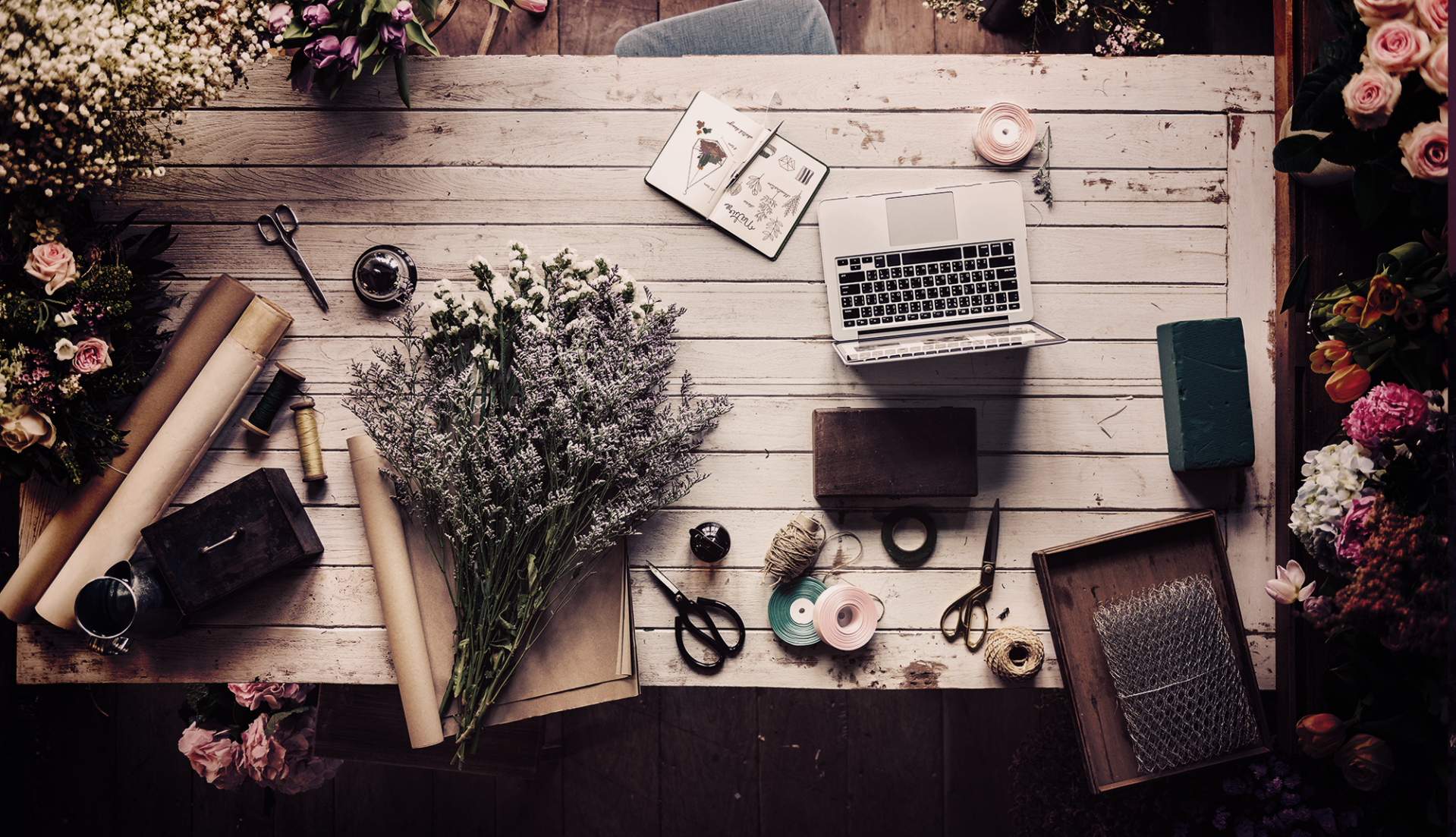
You’re probably familiar with the classic foam poster board covered in paint swatches and carpet samples. This kind of mood board is as essential to our idea of “design” as a pair of horn-rimmed glasses and tapestry vest. For what seems like forever, designers of all stripes have used a physical collage of imagery to brainstorm, set the mood of a project, and help get to the final deliverable. Graphic and web designers brought this process online. But more recently, Pinterest, Tumblr, and collage, layout, and mood-board apps (The Matboard, Evernote) have made the psychological scope of this tool accessible to students, teens, and all sorts of professionals. The focus in many industries today is on the customer or user “experience,” and mood boards have enjoyed a renaissance in part due to their ability to help stakeholders envision the eventual “feel” of a brand or product.
Fueled designer Glenn Hitchcock points out that clients are rarely designers themselves. “Mood boards are also an invaluable source of supportive direction when you’re running your own design concepts by a client. They may not have a design background, and only seeing a handful of screens or materials can be tough for them to grasp the intent,” he says. Mood boards are visual and accessible, and “help clients understand where ideas came from and could go.”
Enter the #Mood Board
Online and offline, we can talk about “traditional” mood boards, used to help clarify your thoughts, ideas, and purpose, and “aesthetic” mood boards. The former can be a powerful way to achieve rapid visual prototyping on a project. The latter may or may not have a purpose other than to collect a set of static images, video, and colors that have a similar feel, style, color… you know, a similar aesthetic. For either use case, both the process of curating inspirational elements and the end result can help get client buy-in, clarify your approach, give you fresh ideas, and instill a harmony in the various parts of a project that no written directive could quite achieve.
They may not have a design background, and only seeing a handful of screens or materials can be tough for them to grasp the intent
Whether you’re a product manager, web designer, writer, mural painter, brand strategist, or artisanal mixologist, I’ll take you through how to make the most of this fun and productive tool.
Curating the Right Mood
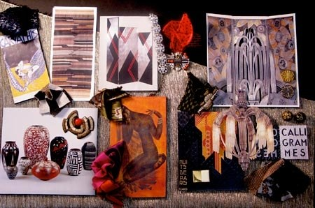
Typically, for an aesthetic mood board, you will start by collecting a set of color- or style-based images that you instinctively feel drawn to. It’s like a visual display of “this is how I feel” or “this is what I like” and offers a medium to connect with others who feel and like the same things. Posted on Tumblr, other users that feel drawn to the underlying mood will repost, in a sense claiming that feeling as their own. The literary mood board for the Ravenclaw Hogwarts house, below, curated by Emily Brown at SparkNotes, offers textures, soft canary, chartreuse, and sunflower hues, and an almost ineffable feeling of air, peace, contemplation, and feminine strength and self-sufficiency.
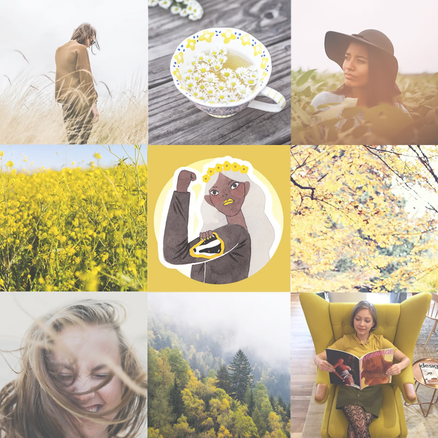
To get started, look everywhere online (and offline) for something that “catches your eye” and pin it (because a LOT of this happens on Pinterest), or save it for later elsewhere. When you’ve exhausted your search and you feel you’re ready, or you’ve simply run out of time, sort out the ones that have a similar color palette or aesthetic style and group them together. Depending on how many you’ve collected, you’ll want to edit your collection down to less than ten. Put them together in a single image and post it online, usually on Pinterest, Tumblr, or wherever you post your photos. There are a bunch of mood board templates available on Pinterest, and some YouTube videos from “those in the know” with advice for putting together your aesthetic mood board online.
The Mood Board Is a Presentation
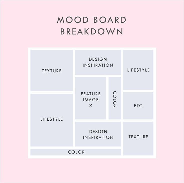
Before we go on, let me be clear: editing, or curating, is essential to this process, whether you’re creating an aesthetic mood board or a traditional one for a specific project. An unedited collection of stuff is just a collection — a final mood board is a purpose-driven presentation that “speaks” to whomever sees it about what your intentions are. If you have a collection of 200 images, that’s a place to start, but you really need to get down to the 20 or so of the best of the best images, font, colors, videos, sounds, keywords, whatever it is you are working with to clearly convey your vision. Fewer, if you’re making an aesthetic mood board. If you are a professional, sometimes you’ll go through more than one round of review and changes to a mood board, even with a client, to make sure everyone is on the same page before moving on to the next phase of the design process.
a final mood board is a purpose-driven presentation that “speaks” to whomever sees it about what your intentions are
The same process and editing rules apply if you present in class on paper or digitally, but you’ll most likely need more and different kinds of items for your traditional mood board than what an aesthetic mood board uses.
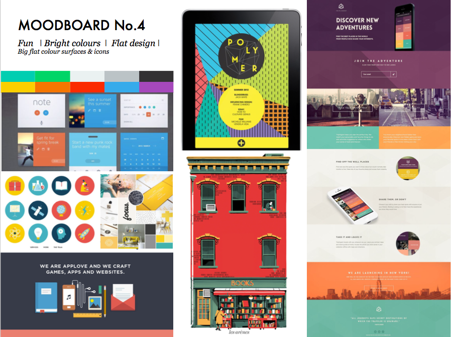
When a digital design team is working on a new product or website/app launch, or even a new brand or re-brand, with a client, the mood board gives all parties something tangible to talk about and react to. The team puts together a mood board, or several, that include imagery, colors, and fonts based on key/target words or phrases the client and/or the design team have selected as their baseline “wants” for the product to be associated with or represent. When initially presenting to a client in-person, some teams use the entire wall, or walls, in the meeting room to put up relevant collateral for the mood board. They may encourage the client to walk around and take down what they don’t like or talk about specific things they see that they do like to get the conversation focused on what the client is after.
If the presentation has to be done online because the team or the client or both are in different locations, the presentation is less tactile but uses the same principles and process to talk through the relevant issues.
A Physical Guide and Reminder
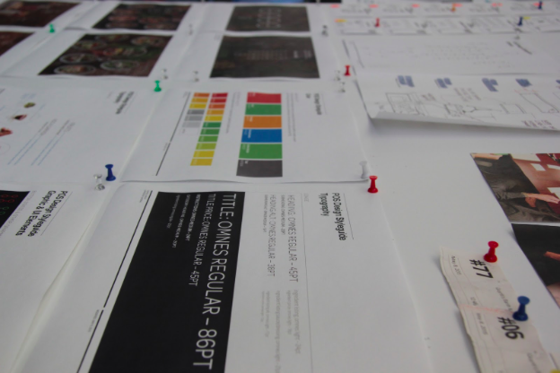
Many designers find that even if their work is entirely online, having a physical mood board, or a print out of the one they created online, in their own work space helps to keep them focused on the original purpose of their project. Sometimes, really, it’s just the thing you need to look at during the “staring out into space but actually working subconsciously” part of the job. Call it daydreaming or call it ideation, that is a real piece of the creative process.

Ask any kind of designer and he or she will tell you that designers have always used their empathy to connect with customers or clients. Pauline Munga, owner of Home Abroad, started her fashion company by connecting her Kenyan roots and current fashion trends in order to appeal to customers who were open to discovering new fabrics and looks from places they may know nothing about. Munga started out with three keywords and built mood boards, constantly referencing what she felt her customers would like best. Her target customers and their lifestyles were always top of mind. Designers want to make sure that their work resonates with the person buying or using whatever it is the designer created and so works towards understanding the full lifestyle and context of a user base or customer type. (Besides mood boards, many design teams will also use “personas,” but that’s for a different article.) This psychological part of the design process has spilled out into the greater, online world with the uptick in online mood boards.
The Apple Test
A great tip on approaching UX/UI uses Apple as a reference point and comes from the head of design at Intersection, Paul McConnell. If the client says they want an interface that’s “clean and simple,” get them to specify what that means to them. Sometimes a client will have seen other work online that they like and want you to mimic, and some want to just see what you come up with. In the case of the latter, use a product or logo from Apple on your mood board and see how the client reacts. You may find that they are very excited — hooray for you, you nailed the project. Or you may find the client thinks Apple is too sterile and unfriendly, and not the kind of “clean and simple” they had in mind. Good! Now you know what you should avoid in the next round.
This psychological part of the design process has spilled out into the greater, online world with the uptick in online mood boards.
Getting to the point of really understanding each other is elemental to any design process, and best to hash this out at the very start during the discovery and strategy phases of the work. (Even if the client and designer are both you. Get yourself very straight with what you have in mind so you can be truly clear on the end result, again, editing helps you get there.)
The Perfect Tool to Shape an Experience
A final thought from Nathalie Hernandez, executive creative director of Brandicts, a branding agency in Mexico City: “Mood boards for our branding projects are like working with the Periodic Elements chart. You take various components, mix them together using the creative design process, and you get a final, new brand that includes visuals, content, and other parts of the brand experience that you and the client are happy with.”
On that note, start gathering your elements, mix strategically, and voilà — a beautiful and useful mood board!
