Every week at Fueled, our London-based Creative Director, Rob Palmer, shares a handful of inspirational websites with our teams in New York, Los Angeles, and Chicago. This weekly email acts as a virtual water cooler, encouraging us to congregate across time zones and discuss what brands and blogs are doing to push new trends in web design.
A Foreigner’s Guide to Polish Cinema

An engaging mixture of old, black and white photos with color and animation, Culture.pl has managed to bring Polish cinema to life inside of a browser window. Multiple layers of animation and images push a new dimension of parallax design bringing a sense of depth you normally wouldn’t see.
http://culture.pl/multimediaguides/
Ponos
Japanese gamemakers Ponos’ website introduces a novel navigation design that still somehow feels natural and intuitive. Lighting fast animations and transitions make for a fun experience.
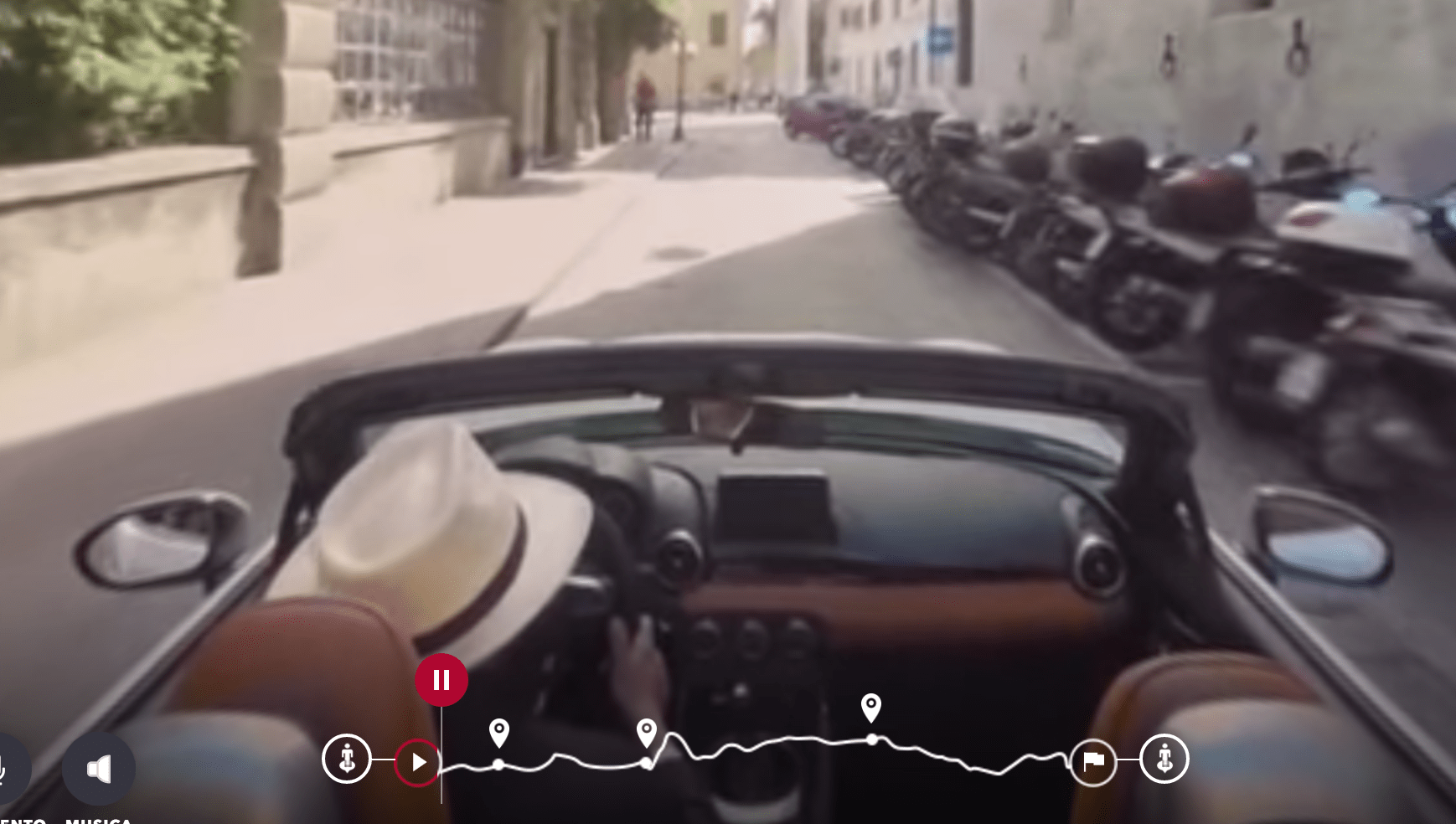
Fiat’s 124Spider Roads

Fiat’s website for their new 124 Spider model lets users ride along on a drive through Italy’s scenic roadways with full 360 degree views. At points of interest, the ride allows the user to trigger popups telling them more about where they are.
http://124spiderroads.fiat.it/
Bert

The website for the creative agency Bert is actually quite simple. No fancy animations or interactivity. They prove that you don’t need fancy tricks to make beautiful things.
Cuberto

Cuberto takes the opposite track of Bert. As an interactive agency, their website shows off their ability to create beautiful motion graphics layered over high quality video. The transitions on this website are a thing to behold, as each click reorients the elements on the screen rather than loading a new page.
Lo Fo Records

Lo Fo’s website is probably one of the more unique designs we’ve ever seen. Everything on the website seems hand drawn with an nod to native African tribal masks and typography. Elements subtly drag behind the user’s scroll motion.

