While Fueled apps regularly top charts, win awards, and get featured by Apple and Google, what really sets us apart is our ability to launch products that delight users while simultaneously generating significant growth for clients. A key element to our success is our product-driven mobile app development process. Our team of all-star product managers help our clients implement app features that balance user needs, business goals, and technology capabilities. This results in products that are uniquely effective for both clients and users, and that succeed measurably in the marketplace.
Mobile App Development Process
How Fueled Creates an App
To give you a sense of what it’s like to work with Fueled, we’ll walk you through our mobile app development process using a recent project with Tony Robbins as an example. A world-renowned author, coach, and motivational speaker, Tony came to Fueled looking for an opportunity to improve his well-known Breakthrough app. Using our product-driven approach, we worked together to revamp the app, driving its app store rating from 2.2 up to 4.9/5 stars while generating significant growth for the Tony Robbins team.

Our first step is in-depth user experience (UX) research. We get to know the problem space and end-users—their stories, wants, needs, challenges, and frustrations. While90% of companies recognize being data-driven as a top priority, only 25% of companies make decisions that are actually based on data.

The data we use is collected from prominent “super users” in order to best understand customer needs. This research allows us to create “data storytelling” to visualize roadmaps and personalized data stories for different stakeholders. Most importantly, it provides useful insight for UX from non-technical users.
Gathering and synthesizing this data allows us to isolate a problem statement and its underlying assumptions. As a picture emerges from this data, we develop initial hypotheses, and bring them to life with concepting and prototyping. We test and validate these concepts with users in real-life scenarios to ensure solution viability and product-market fit. By connecting with real users, we not only deliver the most effective features, but implement them in a way that makes intuitive sense.
Next, we create wireframes, a robust clickable prototype. This will eventually become a full design file that delivers a delightful user experience. Once we better understand the specific needs of your engagement, we choose from dozens of exercises and tools, from ethnographic research to “unfocus” groups, and propose a curated subset of exercises that will validate our assumptions and strengthen confidence in the product vision.

Tony Robbins came to Fueled with five ideas they wanted to build and test. We collected data about each of the five ideas, created simplified roadmaps, and were then able to determine which avenue most effectively increased the core KPI, which, in this case, was more users, while using the least amount of “burn” (capital and resources).
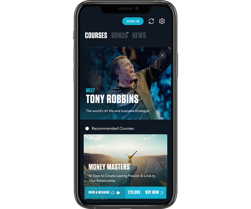
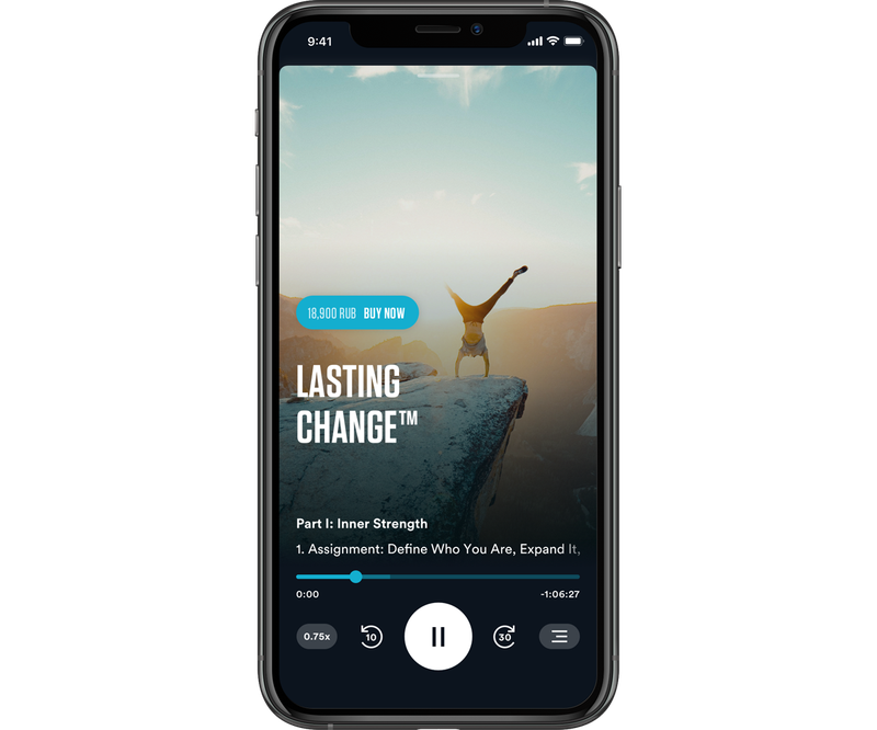
After evaluating each of these five ideas, we looked at the data and decided the most efficient first step was in fact to rebuild and revamp their existing app, Breakthrough. While Breakthrough had amazing features and a great premise, we decided to pivot the way those features were implemented. These changes enabled Breakthrough to finally realize its full potential.
App Design
Our unique design process also contributes to our success. We find it vital that Designers have a full understanding of business and product goals, so we make sure they are engaged in early discussion with the client as well as with our Product Management Team. Our Designers make use of user data to actualize designs that best achieve the overarching goals of the engagement.
Each project is typically staffed with 2-3 Designers, with at least one Senior Designer acting as a lead for the engagement. Close collaboration allows us to validate concepts within the team prior to presenting solutions. Diverse input also allows our team to stray from personal bias and focus on user data.

Designers begin by visualising rough prototypes in the form of mobile app wireframes and interactive prototypes. This allows us to rapidly structure the navigation of the product in order to understand the user’s journey from start to completion, and to be able to iterate on it quickly. Special focus is placed on core features that aim to contribute to the primary business objective.

Once an initial solution is agreed upon by the client and product team, Designers build on the foundation by exploring additional flows that require development consideration. These can range from less prioritised features to validating fields or server responses. This is the point at which Designers ensure the particulars are catered to, and that all minor details are accounted for.
Now we are ready to explore visual design solutions, deciding whether the product will take on the look of an existing brand, or, alternatively, design a new visual identity. Blending the brand with data-driven UI ensures a unique and memorable experience for users. From here we craft more detailed, interactive prototypes that feel closer to the final version, as well as implement transitions and animations that reinforce the user experience.
Designers stay closely involved with Developers throughout the project to ensure seamless communication about the app’s evolving priorities. This also allows Designers to react quickly to any development challenges. Quality assurance is performed every step of the way to ensure the initial designs accurately translate into a final product.

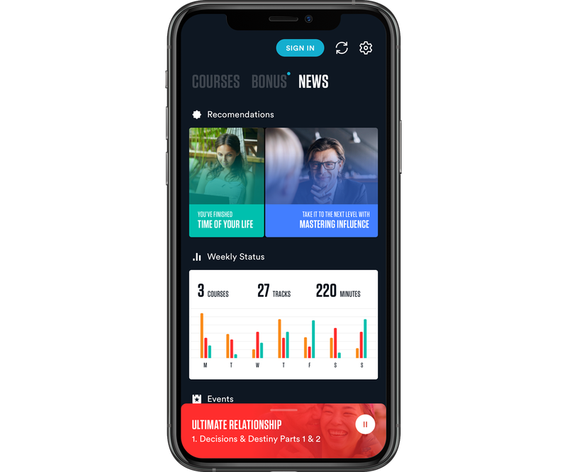
In the case of Tony Robbin’s app, we focused on elevating Breakthrough to make it more conversant with their current branding. We pivoted to a darker, more professional color palette in order to unify and strengthen the look.
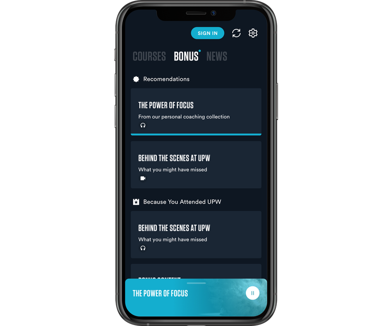
We created a simple click through wireframe using invision to test the feel of the app, and put an MVP into user's and stakeholder’s hands for initial testing, which allowed us to make subtle improvements before going into the app development stage.
App Development
Fueled’s mobile app development process operates in two-week sprints. Often, the root cause for product failures is the tireless attempt to build a “perfect product,” which causes delayed releases and budget overruns, resulting in long term negative impacts. Our agile approach easily and effectively tests each step in order to deliver the best possible product for our client’s user base. At the end of each sprint, we complete a functionality or feature to test and present to our clients.
We typically invite our clients to engage with our process at this point and give feedback at the presentation.
In addition, Fueled sends one of the largest agency delegations to Apple’s Worldwide Developers Conference (WWDC), Facebook F8, and Google I/O to get a first hand look at the latest in mobile software and technology offerings to ensure that we are providing our clients with the most cutting edge options in mobile tech.
For Tony Robbins’ Breakthrough, we developed the app for both iOS and Android. As we developed and tested the app, we continued to tweak the UX, progressively rolling out courses and marketing support for the app.
A client typically meets with the team at the end of each sprint to help test out the latest build or feature, keeping their unique user base in mind. Testing with the client team will vary depending on the project, user base, and available resources.
App Release
An app is never really finished; even the best products need continual adjustment and optimization. Our process is a constant loop of building → feedback and data → problem solving → building. Once the app is released, we track comments and feedback in order to continue improving user experience and growth. Often, we create internal systems that allow our clients to collect data on their app in order to better serve their customers.
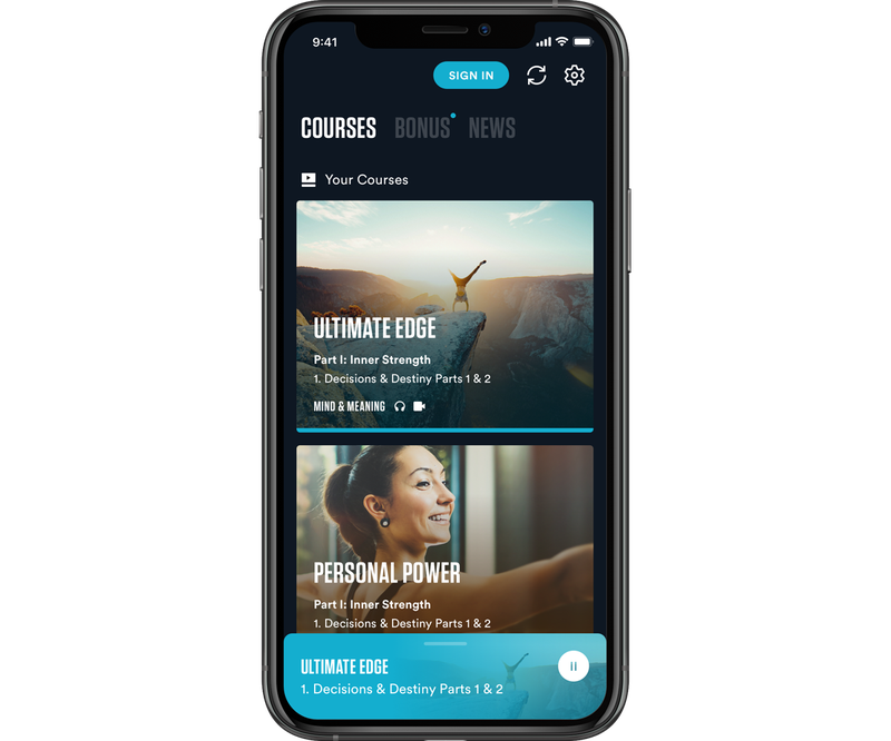
Breakthrough was a runaway hit in the app store, and helped generate tremendous growth for Tony Robbins. Since its release in 2019, we have seen a quarter of a million downloads and counting. The app has generated a whopping 15% increase in revenue for Tony’s company, to say nothing of copious rave reviews at the Apple app store and the Google Play store. We continue to work closely with Tony Robbins and his team to deliver more quality products.
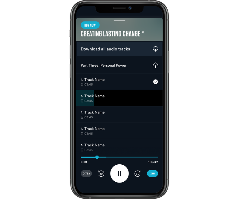
Fueled’s unique, data-driven approach is customized every step of the way according to each app’s needs, potential, and user base so it follows that our development process is different for each project.
We listen closely to our clients, and to the data, and execute our findings with world class design.
Have questions about our mobile app development process?
