⚠️ Warning: This post is over a year old. The information may be out of date.
At Fueled, we spent the last couple months building an awesome augmented reality game called Toppler to explore some of the capabilities of ARKit 2. We’ve already covered some of the technical lessons we leraned in two previous articles mostly related to SceneKit. Now it’s time to get back to UIKit and take a deeper look at some design concepts and their implementations for this more familiar framework.
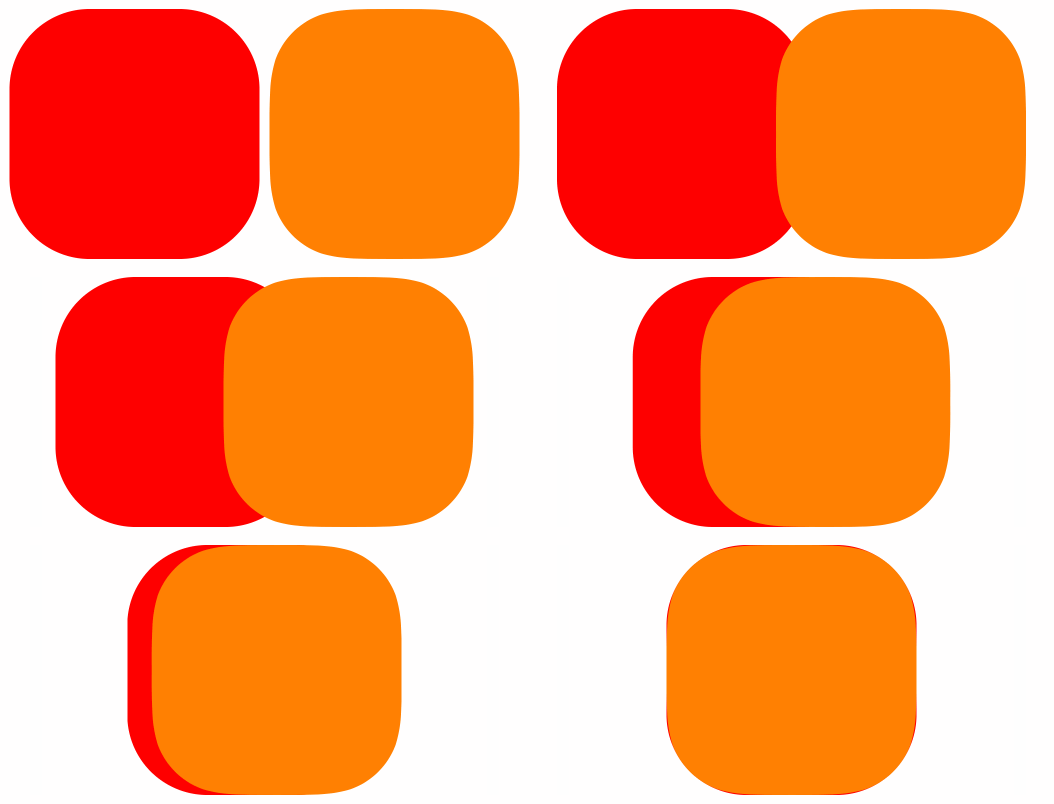
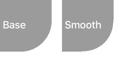
We’ll be looking specifically at rounded corners. Not the ones you usually build with layer.cornerRadius, but continuous rounded corners. Just so we’re clear on the difference, here is a comparison between classic rounded corners and continuous rounded corners that Apple introduced back in 2013, with the release of iOS7:

Notice the very thin red color that you can see behind the orange view. This is the actual difference between base and smooth corners.

For those of you using Sketch, the property to design continuous corners is called Smooth Corners:

Apple uses a private API to power its rounded corners in the SpringBoard. It’s var continuousCorners: Bool from CALayer. However, if you use this API in an app that you submit to the AppStore it will be rejected. 😕
There are a number of resources on the Internet to acheive the same effect in an approved way, usually involvingUIView subclasses and their own implementation of drawRect. However, we’ve been preferring a much simpler solution, which you can apply to any UIView with the help of a mask.
It turns out that UIBezierPath(roundedRect:cornerRadius) produces a continuous corner. Simply using a CAShapeLayer whose path is built with the previous function will also do the trick:
let size = CGSize(width: 100.0, height: 100.0)
let view = UIView(frame: CGRect(origin: .zero, size: size))

// Creating the layer that we'll use as a mask
let mask = CAShapeLayer()

// Set its frame to the view bounds
mask.frame = view.bounds

// Build its path with a smoothed shape
mask.path = UIBezierPath(roundedRect: view.bounds, cornerRadius: 20.0).cgPath

// Apply the mask to the view
view.layer.mask = mask
Code language: JavaScript (javascript)
But stopping there would not be enough since our masked view will usually be resized during animations for instance, and the mask would not evolve in the meantime, unless we update it manually. To solve this issue, we can create a UIView subclass to handle it for us.
To accomplish this, you can override the bounds property to intercept any change, update our mask, and if needed, animate the change. The key to detecting an ongoing animation is to use the animation(forKey:) function, which will return an optional running animation. We’ll copy this animation, to do our own updates, but use the same timing parameters:
final class SmoothedView: UIView {

    var cornerRadius: CGFloat = 20.0

    private lazy var maskLayer: CAShapeLayer = {
        self.layer.mask = $0
        return $0
    }(CAShapeLayer())

    override var bounds: CGRect {
        set {
            super.bounds = newValue
            // Update the frame of the mask with the new bounds
            maskLayer.frame = newValue
            // Update the path of the mask with the new bounds
            let newPath = UIBezierPath(roundedRect: newValue, cornerRadius: cornerRadius).cgPath
            // If the bounds change is animated, copy the animation to mimic the timings
            if let animation = self.layer.animation(forKey: "bounds.size")?.copy() as? CABasicAnimation {
                animation.keyPath = "path"
                animation.fromValue = maskLayer.path
                animation.toValue = newPath
                maskLayer.path = newPath
                maskLayer.add(animation, forKey: "path")
            } else {
                maskLayer.path = newPath
            }
        }
        get { return super.bounds }
    }
}
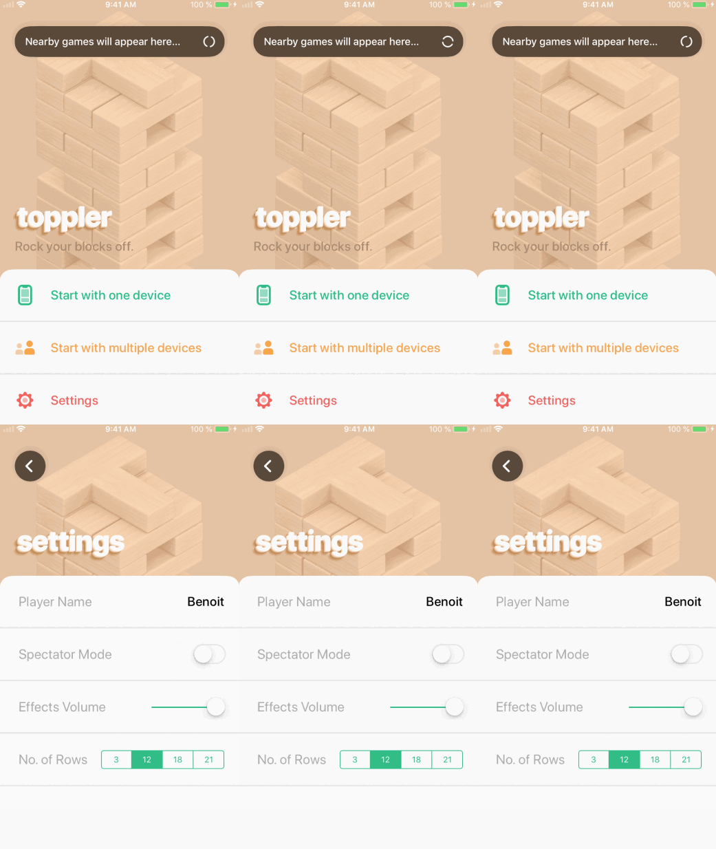
Here’s a preview of what we achieved in Toppler by using these continuous corners alongside some animations and blur effects:

The augmented reality in Toppler represents the core experience. But we mustn’t forget the many other views that tie everything together to create a gorgeous and unique user experience. And that, my friends, always starts and ends with the ubiquitous UIKit.
