We Turned a Fragmented Website Into a Strategic Growth Tool
DesignResearchWebWordPress
We transformed the Vida Health website, harmonizing content and design with a bold new brand vision that engages distinct audiences.
Vida Health provides virtual healthcare for obesity and related chronic conditions, delivered through employers and individual memberships. After numerous unsuccessful redesigns with other digital partners that left them disappointed, it was clear that a superficial refresh wouldn’t cut it; Vida needed a strategic partner to help rethink the site from the ground up. They didn’t just need a better-looking site; they needed a partner to help realign the content and user experience with evolving business goals. Fueled stepped into that role, working closely with Vida to chart a new course for their web presence.
Fueled led a comprehensive discovery, design, and engineering effort. The goal was not just to improve the site’s aesthetics, but to build a platform aligned with business goals, rooted in stakeholder alignment, and powered by a robust and easy-to-use content management system.
Discovery: Laying a Research-Driven Foundation
We led with an in-depth discovery phase to surface challenges and opportunities. Vida’s organization had many voices across leadership, marketing, sales, client strategy, clinical, and product, each with different priorities. In the past, this push-and-pull led to a fragmented site that failed to effectively serve either of its key audiences: B2B clients or would-be individual members.
A successful outcome required getting key personnel aligned on evidence-based insights. Our discovery process provided a neutral framework for Vida to learn about itself and its audiences, and to unify direction going forward.
Key discovery activities included:
Stakeholder Interviews: We interviewed stakeholders across the company, from executives and marketing leads to client strategists and clinicians, capturing diverse perspectives.
Content & UX Audit: Our UX and content designers audited the existing website’s design components and content. We reviewed site analytics and evaluated content against usability best practices.
Audience Journey Mapping: We helped Vida identify and prioritize their target audiences, then mapped those audiences’ journeys from initial awareness to conversion. Stakeholders collaboratively charted key touchpoints and needs for B2B customers and individual members: two groups with very different user stories.
Messaging Workshops: Through guided workshops, the Vida team confronted inconsistencies in how they described their product. The team found it enlightening to hear how others communicated Vida’s value, which helped break down silos and build consensus around a clearer story.
Competitive Analysis: We examined direct competitors’ website design patterns, navigation, program descriptions, and how they communicated value. This market research highlighted gaps Vida could fill and ways to differentiate.
Discovery Insights: Four Objectives to Guide a Ground-Up Redesign
Our discovery process revealed clear patterns in stakeholder goals and audience needs. These insights shaped four key objectives that would guide our design and development strategy going forward.
Support Prospective Members (B2C) as a Key Audience
Initially, Vida’s team believed the site only needed to serve B2B healthcare purchasers, with limited content for individual prospective members. Our research told a different story; engaging members was critical to Vida’s success.
By presenting evidence from stakeholder interviews and user journeys, we helped the client recognize that empowering end-users would ultimately drive B2B value as well. An idea that had been “off the table” weeks before was now embraced as a core strategy.
“It’s like Fueled is the doctor and we just got a full diagnosis and got clear on what is ailing us and what we need to fix.”
Vida Creative Director
Language Accessible to Every Audience
Even for Vida’s primary B2B audience, not all prospective customers and visitors arrive with sophisticated healthcare knowledge. Our second objective was to make the site comprehensible to all, whether a seasoned benefits manager or a first-time visitor exploring weight-loss solutions. We recommended being direct and educational in tone, and only using industry-specific terminology where absolutely necessary. This approach would widen the funnel and ensure no prospective customer felt alienated by unfamiliar language.
Clarity as a Competitive Edge
One of the clearest insights from our discovery was that Vida had trouble clearly explaining what they offer and how it works. This challenge isn’t unique — many B2B digital health companies rely on the same vague buzzwords. We saw an opportunity for Vida to stand out by being direct, specific, and easy to understand.
By focusing messaging around a few core value points (proven clinical outcomes, user satisfaction, cost savings, etc.), Vida could assert a confident, unique voice in a crowded market. Our content strategy prioritized consistency: every page should reinforce the same fundamental story about Vida’s value, tailored to its context.
Connect Content Across the Site to Boost Engagement
Vida had a wealth of content, including thought leadership pieces, webinars, and member success stories, but it was scattered across separate resource libraries and subpages. The old site expected visitors to find their way to this content on their own, resulting in missed opportunities for engagement.
We created a unified Resource Library and surfaced its content on relevant pages. If a page mentioned “reducing obesity-related costs,” it would directly showcase a whitepaper or case study on that topic. By interlinking content, we aimed to keep visitors on the site longer, provide them with richer information, and move them down the funnel more effectively.
Designing the Experience
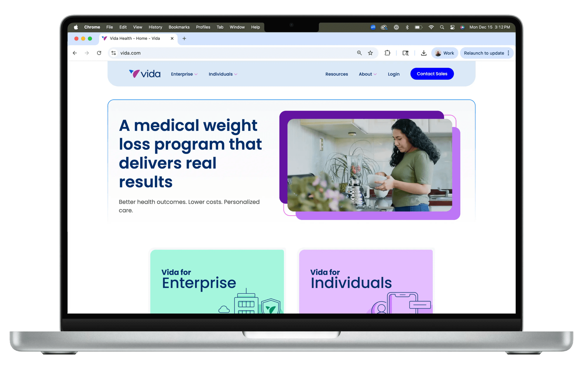
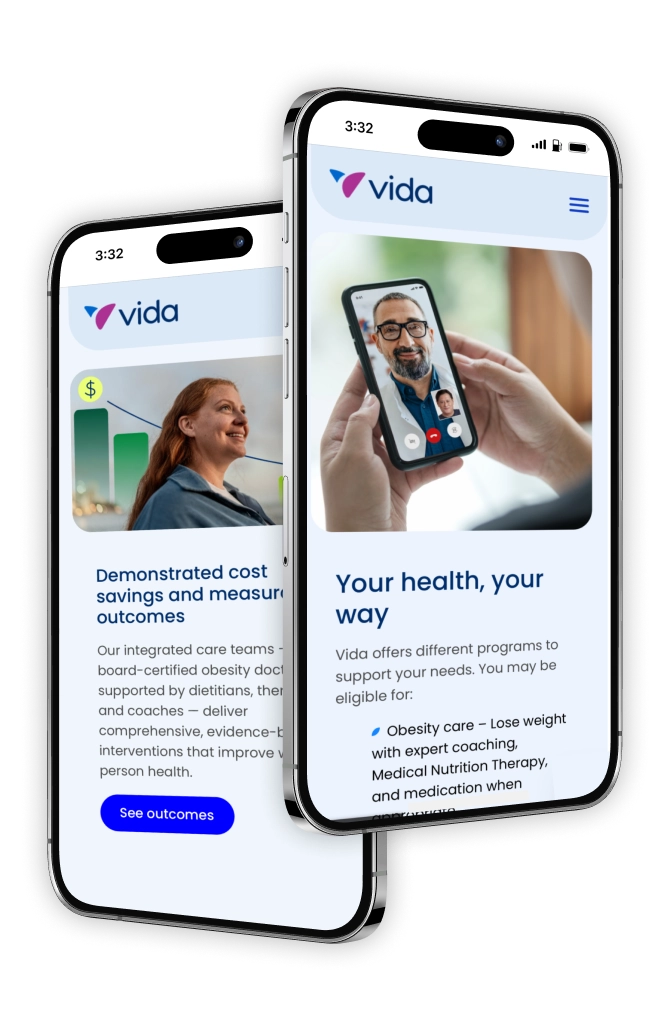
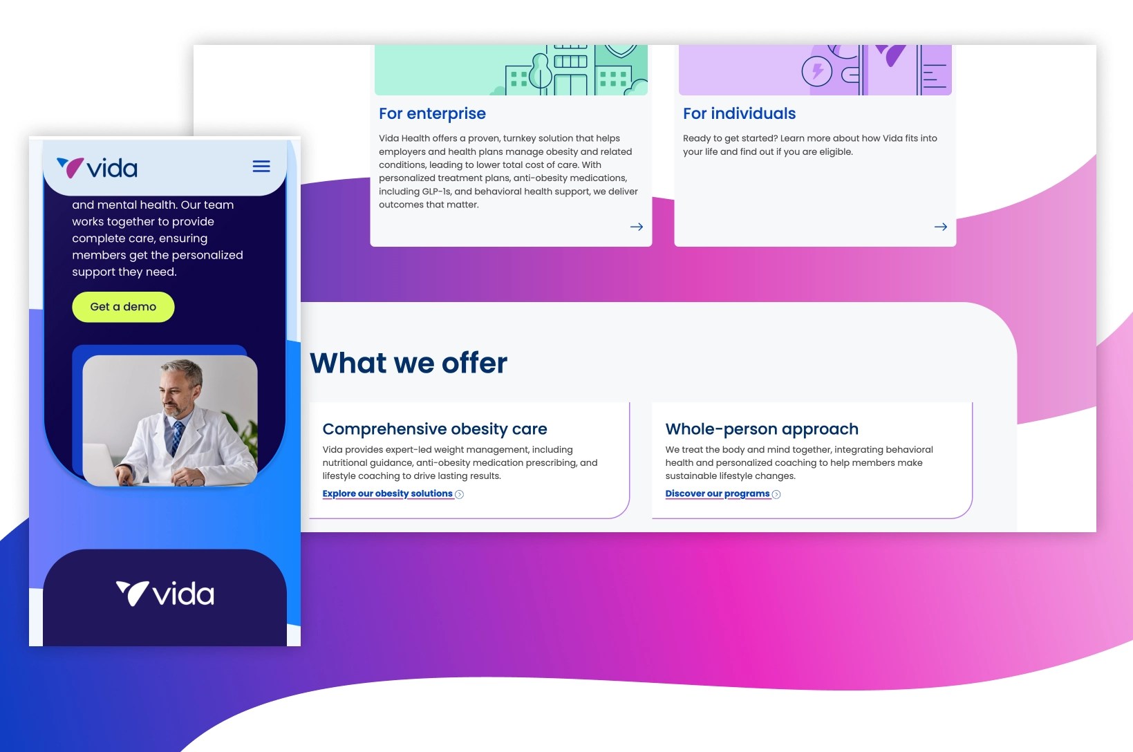
Guided by the four key objectives, our content and visual design teams set out to create an experience. We solved the challenge of serving two opposing audiences by creating a clear fork in the site’s navigation: “Enterprise” for B2B clients (employers and health plans) and “Individuals” for members. These options are visually emphasized in the site navigation, inviting visitors to self-identify. Once an Enterprise or Individual visitor selects their path, the site tailors the content to speak directly to their needs. For example, enterprise visitors encounter pages highlighting clinical outcomes, client ROI statistics, and logos showcasing Vida’s corporate customers. Meanwhile, individual buyers see testimonials, success stories, and supportive language addressing their personal health journey.
We crafted content and layouts that drive user action. Throughout key pages, we introduced content preview cards that pull in articles, webinars, and guides from the Resource Library, tailored to each page’s topic. This two-track approach averted a one-size-fits-all (or “one-size-fits-no-one”) approach with more focused and pertinent content.
Engineering & CMS: Built for Flexibility and Control
Our engineering team brought Vida’s new design vision to life on a modern tech stack. Built on WordPress and hosted on the WP Engine platform, the website leverages the block editor to enforce the design system while affording flexibility in page layout. We developed a suite of custom WordPress editor blocks to support the new design and content features:
A Scheduled Content Swap block for time-sensitive content serving B2B use cases. Vida often launches new employer partner pages and needs portions of those pages to update automatically on a set schedule. With this custom engineered block, content can be scheduled to appear or change at a specific date and time, saving the team from having to do manual updates in the middle of the night.
An Image Decoration block enables editors to add decorative shapes and frames around images, recreating the playful graphic elements from the design without needing a designer’s help.
A Shape Background block gives pages visual flair with dynamic color gradient shapes in the background.
A Logo Ticker block showcases partner logos.
A Stylized Statistic block to highlight key numbers.
A Resources block aggregates relevant blog posts, articles, case studies, and even job listings from a third-party service. Vida content managers can easily customize which resources are presented using a filterable, searchable list housing all of their collateral, with confidence that the latest content is always dynamically displayed.
The platform also supports hundreds of custom member landing pages, one for each company Vida serves. These pages are tailored for each clients’ employees, and include the client’s branding and a unique call-to-action with tracking parameters. Each page was set up using WordPress block editor templates and custom fields, empowering Vida to spin up new personalized landing pages quickly as they onboard new B2B clients.
Impact: A Strategic Partnership Delivering Lasting Value
By investing in research, aligning on strategy, and executing with both creativity and precision, we helped Vida turn a disjointed and subpar web presence into a strategic advantage.
“I’ve been through three different websites at Vida, and I finally feel like not only is our messaging solved, but we understand the intent of our website for the first time.”
Miriam Harwood, Vida Senior Communications Manager
This collaborative transformation has positioned Vida Health to better serve all of its customers, and drive its next phase of growth with the confidence and web marketing tools essential for reach and conversion.
We partnered with Google to make Site Kit, and put tools like Analytics and Search Console inside WordPress… and into the hands of 5 million site owners.