
Something has been frustrating me for a while, and has recently been fueled by a host of excitable ‘top 40 of the greatest websites ever using this effect’ lists, promoting what is essentially false advertisement.
This gripe is to do with the erroneous application and misguided views of true parallax in web design.
The common misconception is shared amongst a few parties.
- The creator (designer, developer, firm) who in some cases is to blame perhaps due to a lack of understanding on what parallax actually is, or maybe because they do not have the ability to implement it correctly, or because they were too lazy to… I won’t continue speculating.
- The promotional site that the work has been featured on. Of course because the work includes some fancy scroll effects it gets blindly bucketed up as a ‘parallax scrolling website’ regardless of whether the creator sold it in as such.
- Finally the audience who seem to be so overwhelmed by these fancy effects, combined with the falsely entitled article they are reading are fooled in to believing the effect they are experiencing is parallax.
The misuse of the effect has become so frequent that it is now being accepted as a given standard.
This article aims to highlight and rectify these views, delve a little in to the meaning of the term and also look at how it should and should not be applied.
So what is it?
First of all, let’s highlight exactly what this word ‘parallax’ means.
Parallax is a displacement or difference in the apparent position of an object viewed along two different lines of sight
Now, obviously this is the simplest of synopses, but it is a clear and concise way to kick things off.
There are two parts to highlight from this single line extract; first is the“along two different lines of sight” part.
Line of sight requires an initial point of reference, and an end point of reference with clear visibility from one to the other.
The other extraction of this line we will focus on is the words “apparent position of an object”.
The object’s apparent position. Let’s keep that in mind, as these two lines together define what is essentially the core difference between true parallax, and a fancy ‘scroll effect’.
This statement tells us that for true parallax to be achieved, there must be a) an object or point of focus, and b) said object must have an apparent position in a given space which is manipulated by movement. In essence, formulating a sense of depth perception or ‘Stereopsis’.
We won’t delve into Stereopsis too much, as we could start discussing other related and interesting topics like lighting and abnormal binocular vision, but from this article what we need to take note is that humans with two working eyes or ‘binocular vision’ have the ability to see using Stereopsis. It allows us to formulate two separate scenes which our brain can then use to calculate depth in a single visual scene. This is the effect we are trying to replicate when applying a parallax effect to web design.
Returning to our chosen medium
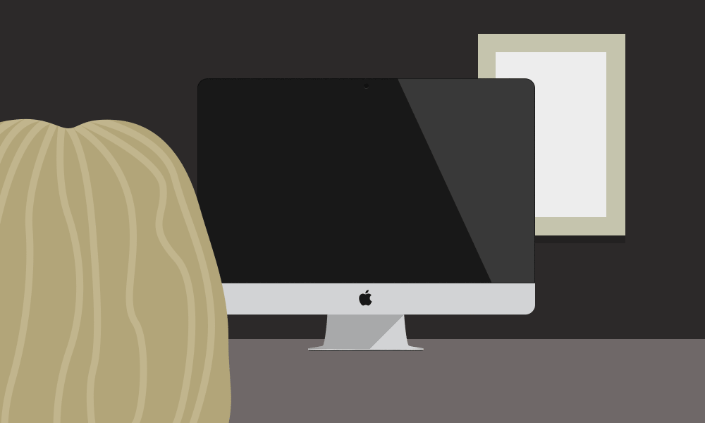
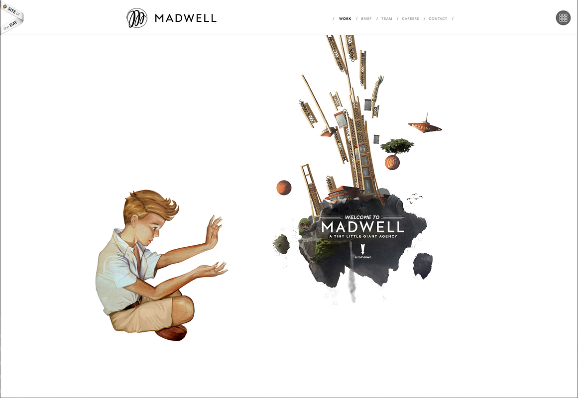
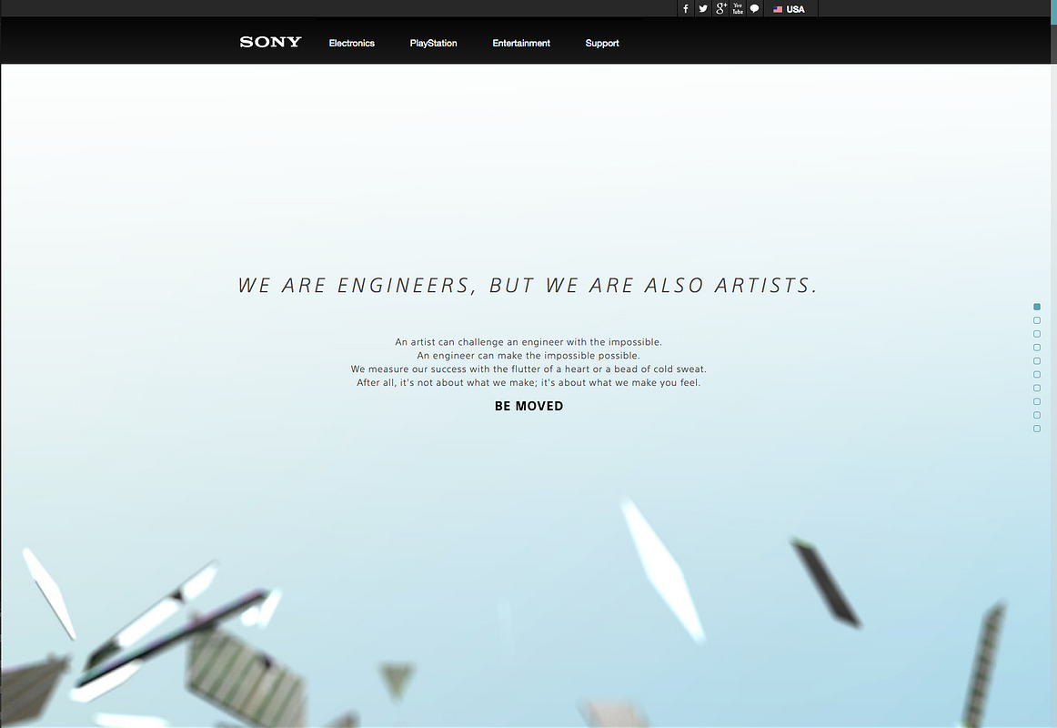
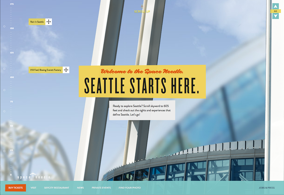
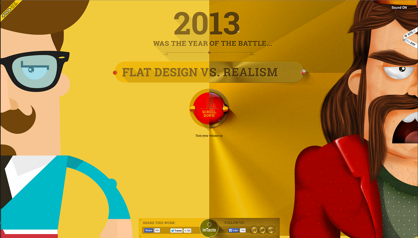
Lets take a look at a few examples of websites which either by the creator, the audience or the featured site are claiming to be parallax. Let’s make an initial judgement as to whether they are or not in fact parallax:
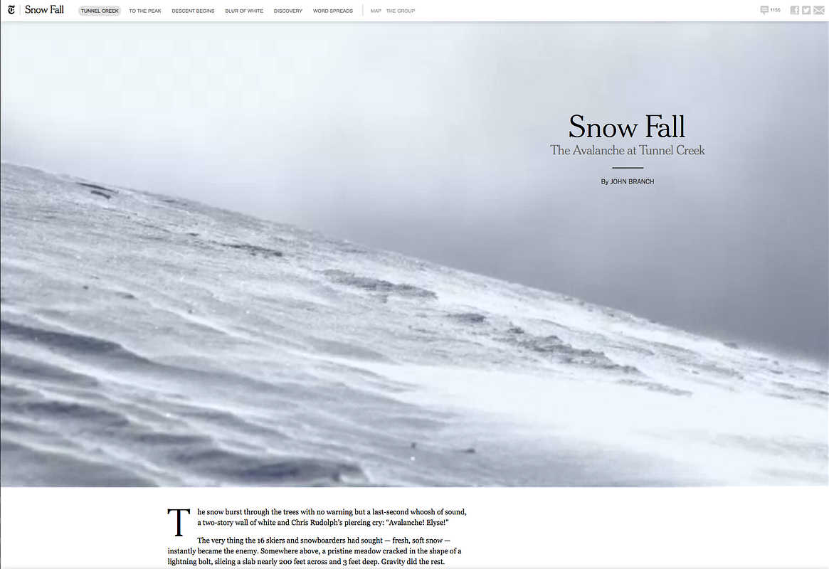
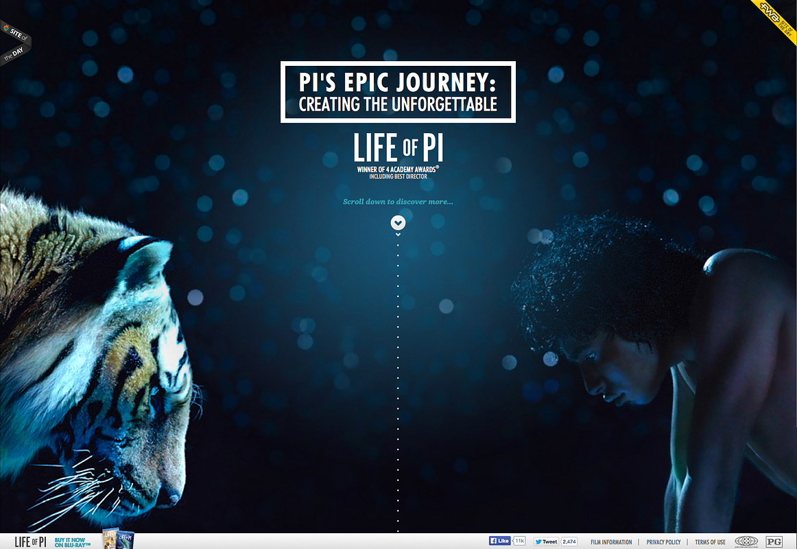


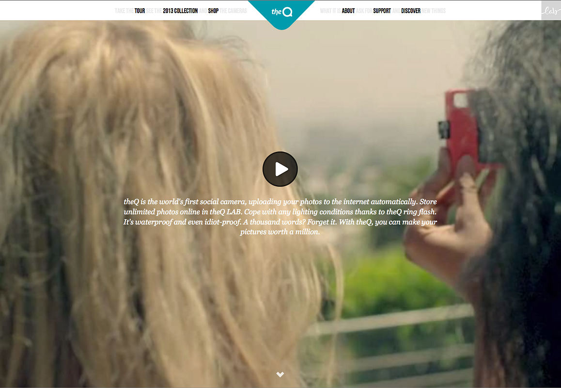
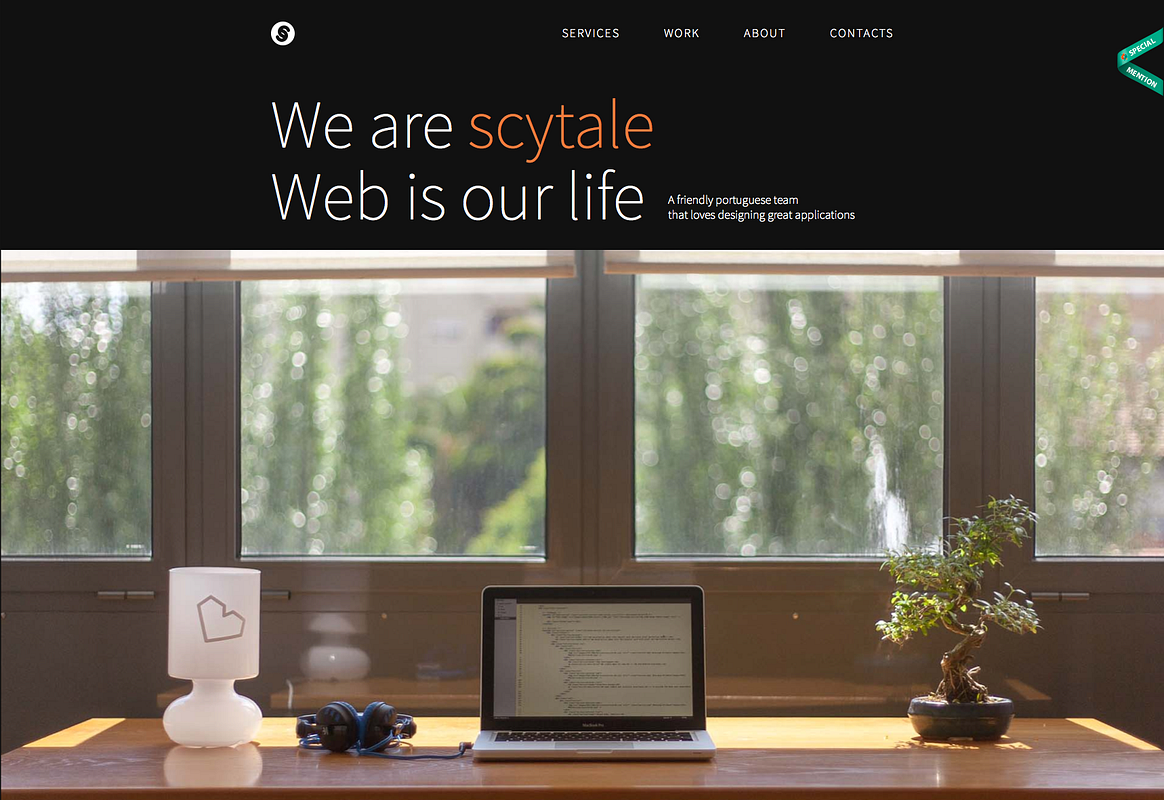

This is not supposed to be a name and shame, as I am not critiquing the actual designs of the sites listed. I am only focusing on if the effects used on them are parallax or not. All the above have been featured on different lists of ‘some amazing examples of parallax websites’ or ‘top 30 parallax scrolling sites’.
None are in fact parallax. Did you think they were? The sites above are either using different scroll effects to simulate movement of objects not naturally expected by the user, or simply sliding two planes over one another at different scroll speeds.
This is not parallax. Why? Well let’s go back to our initial dissection of our extract from Wikipedia. Where is the object? Where are the two lines of sight? You cannot effectively create true parallax without these.
A real life test
I want to now carry out a simple test to use as a demo of this effect in real life. It can be achieved whilst you are reading this article. Ideally for this test you will be sat at a desk with a device or PC in front of you and a wall behind it. Simply sit back so the whole device is in your peripheral vision, then whilst keeping the device still, lean your head to the left and right as if you were looking to see what is going on around your device.
Now slide the device out of the way and carry out the same leaning motions in the same position, sans object.
All you have now is a flat wall which you are looking at from different angles, and other than a shift in lighting does not give us the required sense of Stereopsis we are after.
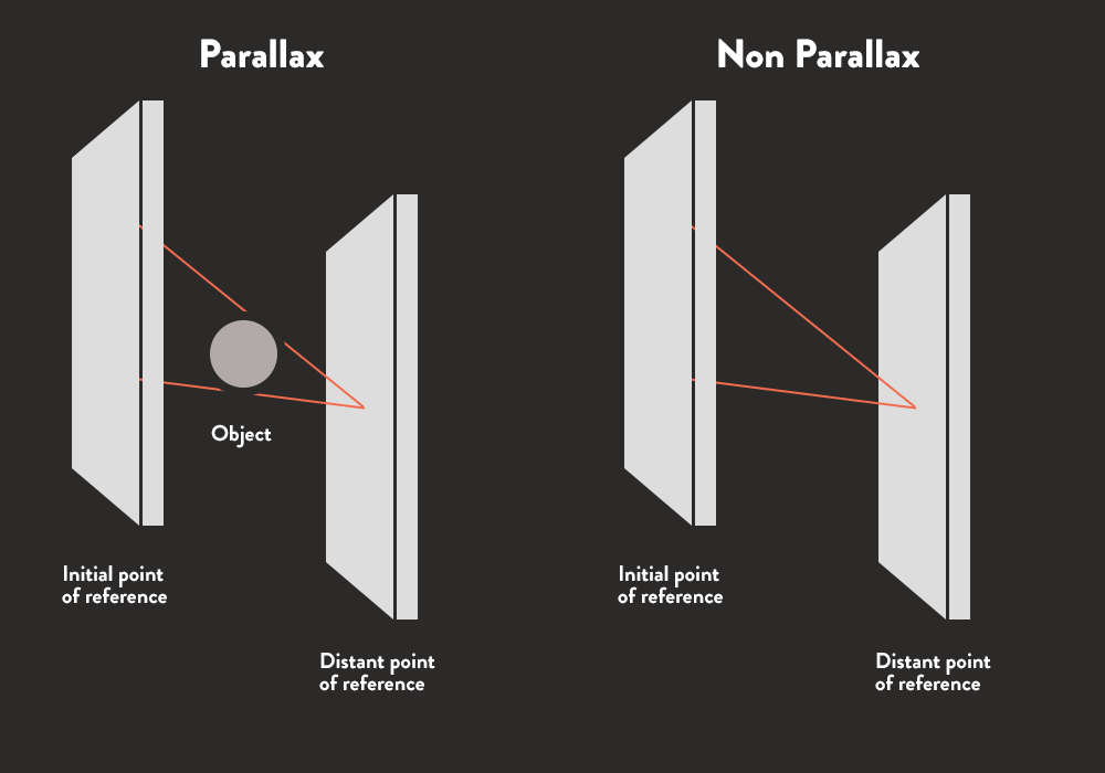
Here is a a crude graphic to further highlight the effect.
Notice as you lean, you can see more wall. This is because the screen (the object) is closer to you than the wall (distant point of reference) therefore appears to be moving faster, hence giving us depth perception.
Another interesting take away from this experiment is if you keep both eyes open and lean to the right to a fixed position, then close your right eye, you will see less wall.
Due to our binocular vision our left eye is attempting to see the wall at a more acute angle around the object, therefore can see less of it. However keeping the same lean position if you then open your right eye and close your left, you see the same amount of wall as you did with both eyes open.
This is our brain detecting the existence of disparity from the input of our eyes, basically letting us know that if the eye with the furthest disparity can see the distant point of reference it doesn’t matter if the other cannot, it will project that image back to us but without the same level of depth perception.
This is all to do with Binocular disparity which is also important in understanding true parallax.
So what do you need to achieve true parallax in web design?
True great parallax in web design is the art of faking real life Stereopsis. We have already highlighted that we need two lines of sight and an object in order for this effect to truly work.
This means for websites we require:
- The viewer, or an initial point of reference.
- An object.
- A background, or distant point of reference.
- Finally an action, something to trigger movement.
Some of the sites in the list above could have been adjusted to replicate pure parallax if they shifted the initial point of reference from being the content to being the user, then manipulated the position of the distant point of reference based on the user’s movement whilst viewing the screen. There are a few browser experiments around that utilize the desktop camera to track what angle the user is viewing the screen and changes what is displayed accordingly.
Effectively if this was applied the user would become our No.1 in the required list of elements, the ‘initial point of reference’. The content layer or front slide would become ‘the object’, and the background slide would become the ‘distant point of reference’. Hence giving us depth perception.
This however is not at all practical for browsing a website! So until such time as motion control becomes the norm, this is not really a viable option.
What are the above examples missing?
The object.
The object is our pivot, our focus. Creating two scrollable planes which move up at a slightly different velocity to one another is fine, and gives a nice effect when the user scrolls, however it is missing our key ingredient. The object. The front sliding plane is our initial point of reference, the back sliding plane is our distant point of reference. But in order to achieve the desired effect, we need to add the object.
The object can move, but only to a degree that renders the motion of the other two planes realistic.
In our experiment above, if you happened to lean to the right on your chair and your device or PC (the object) suddenly slid to the left twice the distance than the angle in which you moved, then this would feel unnatural. So if motion is applied to the object, it should feel natural.
Remember we are trying to mimic Stereopsis. So when compiling an area of your design that you intend to be parallax, consider the movement of each element involved and how it will transition. Here is a simple example of parallax using a scroll effect.
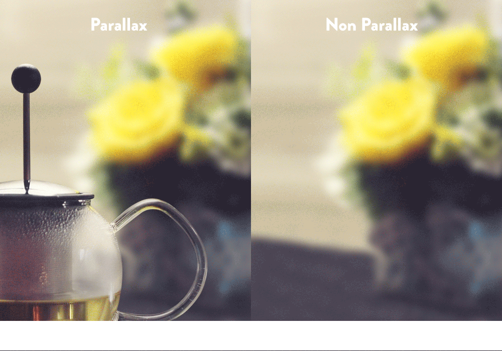
Notice the parallax version includes our initial point of reference (the content overlay) the object (glass tea percolator) and our distant point of reference (the background and flowers).
To further enhance the effect and to demo real parallax on the web,Matthew Wagerfield & Claudio Guglieri created the brilliant Parallax.js that not only offers a true sense of parallax but also picks up on tilt actions on phones and tablets equipped with gyroscopes.
To sum up
As designers, in order to apply a style or effect to any design, we must first understand it. Parallax in web is a trend, and if we are going to use it as a technique to enhance our designs, we should certainly learn the fundamentals and take the time to understand it.
Rather than grabbing an off the shelf jQuery plugin or making your background image fixed and state your design is parallax, have a read of the articles linked above. After reading just consider the effect, consider it’s application and whether it really offers an added value to your project.
As a client/consumer, don’t be fooled when a designer sells you on a parallax site, ask them what they intend to do in order to achieve the parallax effect and why it will benefit your product.
It can be very distracting and when used incorrectly focus the user’s attention away from your core messaging. Never forget the content and only request a section of a design to be parallax if you and your designer agree it enhances or improves the overall user experience.
For all those gallery sites with your lists of ‘top 20 featured parallax sites of all time’ I have just one request. When discovering a website with a cool scroll effect, really consider if it is parallax or is it just a cool scroll effect. Please don’t just play off a buzzword in order to promote people’s work incorrectly. As doing so will just further confuse the community to the correct application of the effect.
I want to finish with some websites that I feel use true parallax both effectively, and are fantastic creative examples of what it really is.

This post originally appeared on Medium.
Find Mary Hurd’s Google Plus profile here: Google

