 I usually tend to avoid high-profile apps in my reviews. I like to highlight smaller devs to bring attention and visibility to lesser-known apps. But when looking at hotel and rental apps, it’s hard not to mention Airbnb. In a way, it’s still the underdog compared to Hyatt, Marriott, and other big hotel chains.
The app started on iOS and came from a tiny startup not so long ago. Design, ease of use, and the mobile-first strategy have been paramount to its concept. As it’s grown, it has had its share of issues with the actual rentals, but it’s hard to deny that it is still one of the best-looking apps on the marketplace.
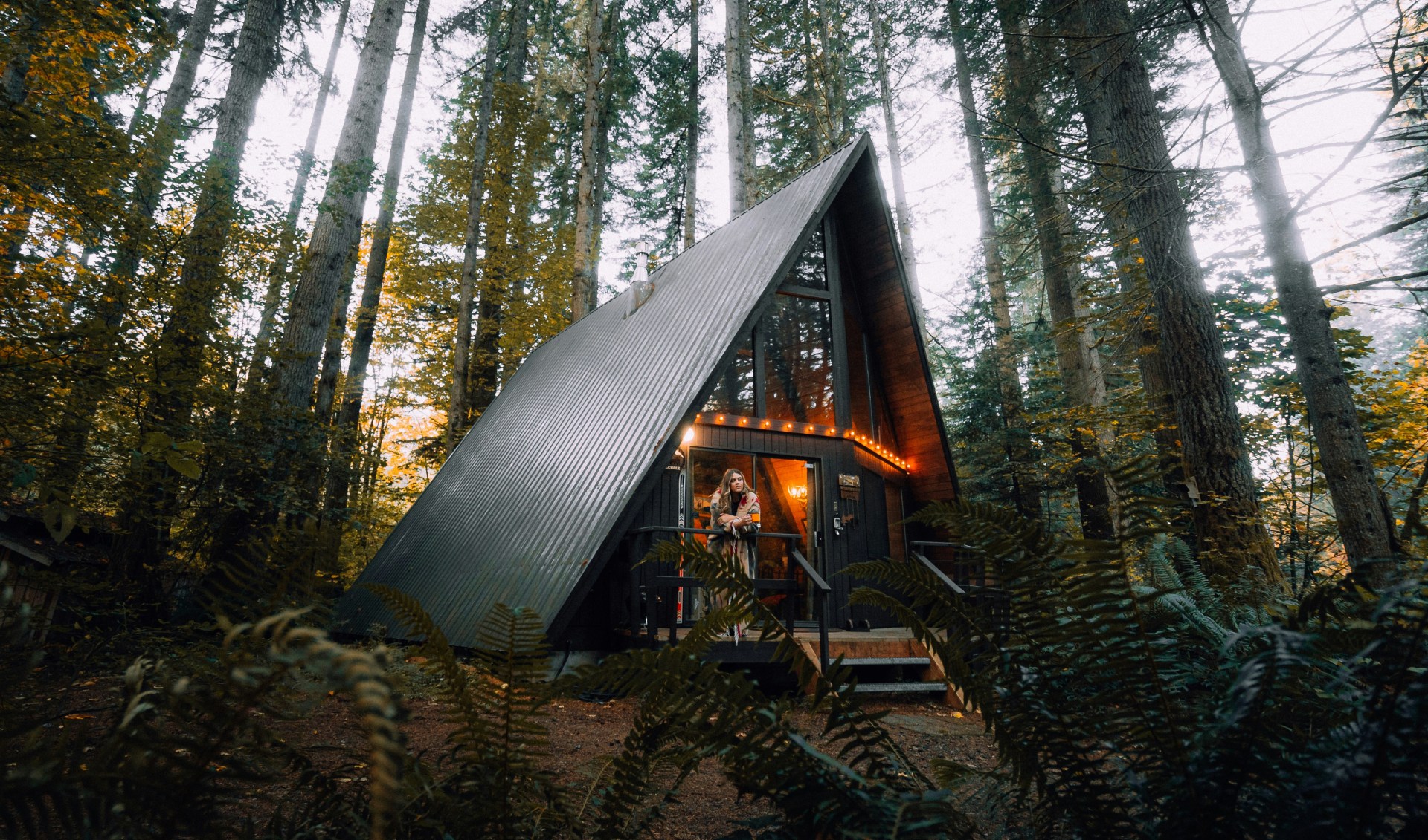
The Airbnb app is full of enticing photos, inspiring users to dream about visiting new locations. It encourages users to rent their own property versus staying in a hotel room. Most lodgings have exquisite photos — which should come as no surprise these days as there are professionals who will help design Airbnb profiles.
Each location has photos, reviews, general location, and home details. It’s easy to see at a glance how many bedrooms, bathrooms, kitchens, etc are in a home. You can also filter this information to help find a home that’s the appropriate size for your party.
 Once you have booked a home, it shows up in a dedicated trip tab. Here, each trip is inset as a card. There’s a subtle shadow behind it that adds depth for a more dynamic UI. It’s not at all skeuomorphic, yet it feels modern and polished.
While Airbnb pulls from a lot of native iOS frameworks, the UI is mostly custom. I love the search box especially. It’s a floating oval with the tell-tale magnifying glass, but it also gives search suggestions and lets your filter your results. It isn’t too busy but is easily identifiable and helps suggest use cases.
All the icons in Airbnb are custom. It’s a nice touch that brings the app full-circle with its logo. The logo, a swooping line, matches with all the other line icons in the app. It’s a great example of cohesive design.
I’ve used the Airbnb app quite a few times while traveling and it has always been great. Much of that comes from the in-app experience. Despite its simplistic look, it’s an app with real value and depth which has been crafted through years of work.
But enough about other people’s apps.

