Most of the apps I tackle are usually all software. Not hardware-dependent. Cradlewise is a bit different but the app looks so great, that I wanted to bring a bit of attention to its design. It’s a companion app to the Cradlewise crib, a smart baby accessory that can use AI to lull your kiddo back to sleep as it stirs during the night. It does a lot of things and the app needs to be well-designed to make it comprehendible.
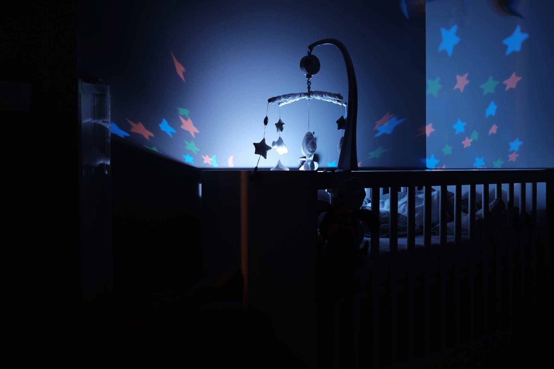
Here’s a rundown on the Cradlewise device. It’s a wooden bassinet that converts to a crib and is able to hold your little one from the day they’re born until they’re two years old. It has a top-down camera to monitor your baby and it will use AI to learn its sleep pattern. As it detects the infant starting to wake up, it will play soothing white noise and gently bounce up and down to help it get back to sleep instead of troubling you. It has curated music tracks, an integrated baby-monitor, sleep analytics, and access control for different people on your care team. All of that is managed from the Cradlewise app.
This app is very visual with pleasant aesthetics. It employs a barrage of custom iconography from a miniature version of the crib to the music library. When you launch the app you’ll immediately the status of your baby, assuming they’re in the crib. There will be a live view of your little one and a welcome, letting you know how long ago your baby fell asleep or any other relevant message. You can immediately snap a picture — you know, cause they’re so freaking cute!, start bouncing the crib, or start playing music. I love this because it gets you to what is most important first — your child.

You can then use the bottom tabbar interface to navigate through the app, including the baby’s activity, your music playlists, or your notification history. The sleep analytics screen is also incredibly well done. What you’ll see is an icon of your baby in the center and a graphical clock dial around the edge. This dial lets you know what your baby was up to for each hour of the 24-hour day. It breaks it down between awake, restless, sleeping, or not in the crib. It uses shades of the apps primary color, pink.
The in-app music is broken down into playlists, as well as individual songs. You can favorite songs and create your own playlist. The pre-curated playlists have original artwork to go with that looks calming and indicative of the audio’s theme. Finally, I wanted to touch on the customization controls. Cradlewise has the ability to add multiple people to the caregiver team, allowing various levels of control and access to each. It’s incredibly important to be able to protect your child, while also enabling those looking after them to best care for them. For example a babysitter may want to be able to control the music, but not access the camera.
This app is very niche and its reliance on an expensive piece of hardware puts it outside the scope of typical users. But the app is a fantastic example of how a great piece of hardware can be elevated by a sleek and enjoyable app. A poor app experience can sink a solid hardware startup, even if it has less visibility in marketing. Kudos to Cradlewise on a job well-done.
But enough about other people’s apps.

