Recently our designer came with this gorgeous selector to pick color values on a linear scale:

Even though it might look complicated, it is pretty simple once you break it down into separate components. In this article, I am going to walk you through the process of creating it from scratch.
Divide and Conquer
The whole implementation can be divided into four components:
- drawing the circle
- drawing the gradient slider
- scaling the circle down on touch and animating the slider
- selecting the appropriate value based on where user lifts the finger
So let’s start with the first one, shall we? Actually before that, let’s lay down some ground work which will help us to write less code.
ObservableProperty
We will write a nifty observable property so that we do not have to call invalidate() on our view every time we update a property.
private fun <T> viewProperty(default: T) = object : ObservableProperty<T>(default) {

 override fun beforeChange(property: KProperty<*>, oldValue: T, newValue: T): Boolean =
 newValue != oldValue

 override fun afterChange(property: KProperty<*>, oldValue: T, newValue: T) {
 postInvalidateOnAnimation()
 }
}
Now instead of writing var radius: Float = 0F , we write var radius: Float by viewProperty(0f) . Whenever the radius changes, the view will be invalidated automatically. This is particularly useful during animation as you’ll see shortly.
Sizing it up
Before we get to any drawing, we will need to determine how big our view will be. For SlideColorPicker , I decided to limit it to the size of the circle. To draw the gradient slider, we will draw outside our bounds by adding android:clipChildren=”false” to our parent layout. Now then, let’s get to drawing!
1. Drawing the Circle
Firstly, we will need a circle. It can be drawn easily by writing:
canvas.drawCircle(centerX, centerCircleY, radius, circlePaint)
centerX is equal to width / 2 of the view. Since the circle will only be translated along the vertical axis, this value will never change. Similarly, circlePaint will be unchanged. The two interesting properties here are centerCircleY and the radius. Since changing them will require the view to be redrawn, they are defined using our viewProperty delegate.
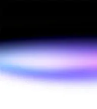
We will end up with something like this:

2. Drawing the Gradient Slider
Next up is the gradient slider. It can be achieved using a rectangle; a rounded rectangle to be precise.
canvas.drawRoundRect(
    left = centerX - originalRadius,
    top = centerY - rectHeight,
    right = centerX + originalRadius,
    bottom = centerY + rectHeight,
    originalRadius,
    originalRadius,
    colorGradientPaint)
halfRectHeight will be changing on each draw call. It varies from originalRadius to the expanded height, which is equal to originalRadius * heightMultiplier. The following image should help in visualizing the values.

You will notice that we are using drawRoundRect instead of drawCircle to draw the colored circle in the collapsed state. It is just that the radius of the corners is equal to height/2 of the rectangle which is why it looks like a circle.
As for rectanglePaint, we apply a gradient to it when we are in the expanded state whereas in the collapsed state, we just show the selected color.
3. Animation!
Now comes the most interesting part —animation!
Following our divide and conquer principle, we need to do 2 things when the user touches the screen
- scale down the circle
- expand the slider
Furthermore, we want these animations to play in tandem. So, when the scale animation is at half the progress, so should be the expand animation. And when the user lifts up their finger, we want to reverse the animation.
For this reason, we will be using a ValueAnimator which goes from 0 to 1 and observe the values using an update listener. First things first, let’s define an enum which will help us to identify whether the touch event is DOWN or UP .
enum class TouchAction {
DOWN, UP
}
Now, using the touch listener, we can play the animation whenever the user interacts with our view.
when (event.action) {
 MotionEvent.ACTION_DOWN -> {
     runAnimation(TouchAction.DOWN)
 }
 MotionEvent.ACTION_UP, MotionEvent.ACTION_CANCEL -> {
     runAnimation(TouchAction.UP)
 }
}
Finally, let’s implement the function which performs the animation:
 private fun runAnimation(action: TouchAction) {
     animator.apply {
     removeAllUpdateListeners()
     cancel()
     addUpdateListener {
         val value = it.animatedValue as Float
         animateCircleScale(value, action)
         animateRectangle(value, action)
         if (action == TouchAction.UP) {
             animateCircleToCenter(centerCircleY, value)
         }
     }
     start()
  }
}
A bit of boilerplate here, but the primary functions we are concerned with are animateCircleScale, animateRectangle and animateCircleToCenter. Let’s walk through them one by one:
animateCircleScale- It is responsible for (no points for guessing) animating the circle’s scale.
private fun animateCircleScale(
 animatorValue: Float,
 action: TouchAction
) {
     val (startRadius, endRadius) = if (action == TouchAction.UP) {
         scaledDownCircleRadius to originalRadius
     } else {
         originalRadius to scaledDownCircleRadius
     }
     radius = lerp(startRadius, endRadius, animatorValue)
}
As you can see, we decide the start radius and end radius based on the user’s action, and then just assign the lerp-ed value to radius. And since radius is an observable view property, we do not need to call invalidate() manually!
If you are wondering what the lerp function does, check out this great explanation. I will be perfectly honest, I had seen this function before in other animation tutorials, but it didn’t quite click for me until I had to use it myself ?
animateRectangle- No points for guessing (didn’t he just use this phrase?) what this function does — it updates the halfRectHeight property which in turn triggers the re-drawing of the view. Doing this each time the value animator updates results in the effect of expanding slider as seen in the animation.
private fun animateRectangle(
 animatorValue: Float,
 action: TouchAction
 ) {
     val (startHeight, endHeight) = if (action == TouchAction.UP) {
         expandedHeight to originalRadius
     } else {
         originalRadius to expandedHeight
     }
     rectHeight = lerp(startHeight, endHeight, animatorValue)
 }
animateCircleToCenter- You won’t get any points for guessing what this function does (this is the third time, what are these writing skills) — it animates the circle back to the center when the user lifts their finger. This is achieved by
centerCircleY = lerp(currentY, centerY, animatorValue)
We will also need to add the gradient to the rectangle paint on ACTION_DOWN . This is done using a linear gradient
val gradient = LinearGradient(
    x0 = 0F,
    y0 = originalRadius - expandedHeight,
    x1 = 0F,
    y1 = originalRadius + expandedHeight,
    startColor,
    endColor,
    Shader.TileMode.MIRROR
 )
Its height will be equal to the height of our view in expanded state. Then we just apply it to the paint like so
colorGradientPaint.shader = gradient
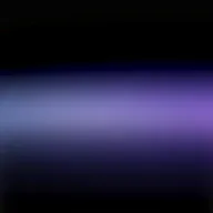
We now have something like this

We are slowly but surely getting there! ?
Now let’s add drag support for the circle. Simply add an additional branch to the when expression in onTouch method for ACTION_MOVE and set centerCircleY to the Y value of the motion event.
4. Value Selection
Lastly, let’s update the selected color.
private fun setSelectedColor(position: Float) {
    val progress = (position - upperLimit) / (lowerLimit - upperLimit)
    val colorRes = ArgbEvaluatorCompat.getInstance().evaluate(progress, startColor, endColor)
    colorGradientPaint.shader = null
    colorGradientPaint.color = colorRes
}
We calculate at what point the user lifts their finger along the gradient rectangle. Then we evaluate what color will that progress value evaluate to using the ARGB Evaluator. Once we calculate that color, we apply that to the rectanglePaint and remove the gradient.
Just a little disclaimer, this view doesn’t let you pick the exact values and nor does it aim to (you’ll find that the math reflects that ?). The current implementation is what we wanted. You can easily modify parts of this code such that the color selection becomes more precise.
Fin
So that’s it! This is the first time I have tried to implement a custom view with this many moving parts. It was a really interesting experience so I thought I might share it. I was thinking about creating a library but decided against that due to the limited use-case. Nevertheless, here is a repo containing the full code.
Thanks for sticking around till the end, hope you learned something!?