Every week at Fueled, our London-based Creative Director, Rob Palmer, shares a handful of inspirational websites with our teams in New York, Los Angeles, and Chicago. This weekly email acts as a virtual water cooler, encouraging us to congregate across time zones and discuss what brands and blogs are doing to push new trends in web design.
VR Ultra Noir

VR Ultra Noir takes you on a journey with bold white neon lights and high definition black and white videos. The homepage of the site is built with seven different slides, and when scrolling up with your mouse, they seem to click into place like an old slide machine. The navigation bar stretches along the right side of the page and lights up to represent your progression through the site. Transitions are swift with oversized bold white numbers that count to 100 until you reach the next page. The coolest part of the experience are the sound effects in the background as the neon white lights rotate and illuminate at the center of the screen.
Perverte X

The Perverte X website’s cool homepage immediately draws in the viewer. Each page is colored in a different hue but all consistently have a hazy background with matte colors. Bold words fill the page, and when hovering over each of them, the font becomes glitchy – or rather, jittery – bringing a sense of life to each letter on the screen. Page transitions are also unique and interesting: By holding your mouse down, a series of images flash upon the screen and bring you to the next page. Everything on the site appears above the fold, giving it a feeling of continuity, and ultimately connecting the viewer with the interactive experience.
Audiograph

For the real music head, Audiograph gives its users a truly engaging and stimulating experience, both audibly and visually. Everything on the site is built above the fold, so scrolling isn’t necessary at all. The entire experience is as though you’ve been dropped into a live concert – but with the control in your own hands. Your spacebar controls which song is playing: clicking skips to the next one, and holding it down gives you the title of the track. Though the choice of music is certainly cool, the visuals on the site are by far the most mindblowing part of all. Trippy 3-dimensional spirals move from the center of the page outwards to the borders of the screen and they are reminiscent of the inner skeleton of a grandfather clock. As a whole, the warpy visuals of this site’s web design, coupled with the smooth electro sounds, would certainly make for an exception LSD-experience.
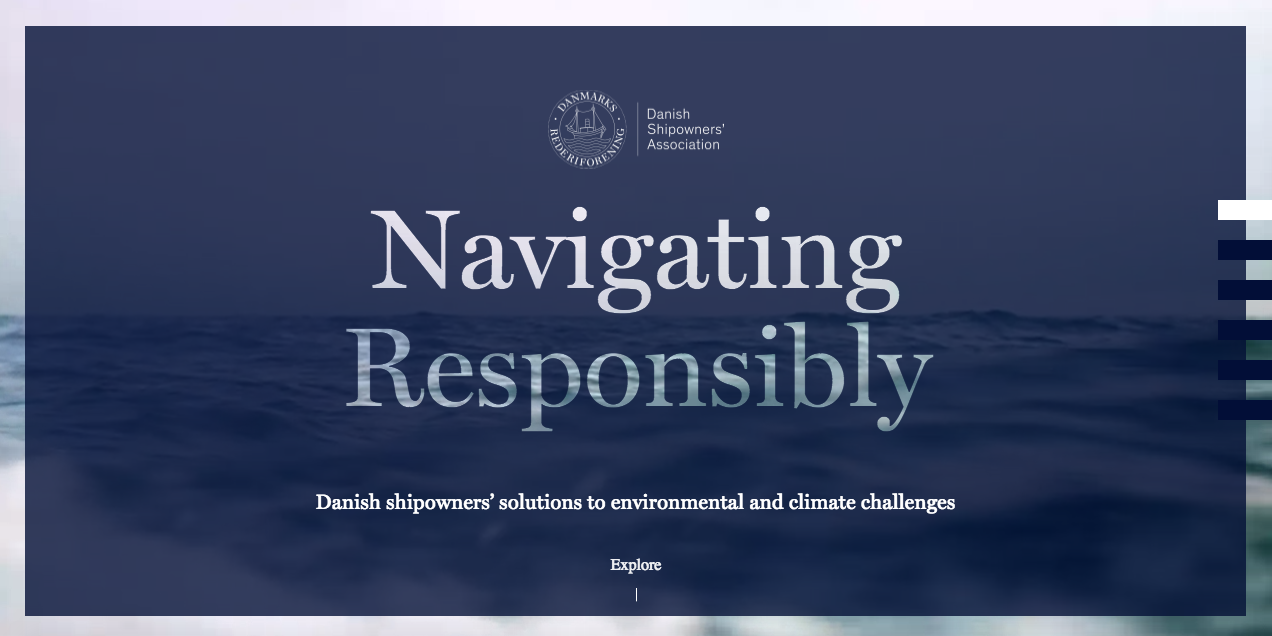
Navigating Responsibly

Navigating Responsibly is a site dedicated to relaying information about the transportation of goods throughout the world. Both informative and visually pleasing, the site’s web design paired with the statistical facts are impressive and interesting. Many icon movements and page transitions are nostalgic of waves, in that the image dissects into curvy concave and convex strips that swerve off the screen before the next page appears. The navigation bar sits to the right side of the screen set up with similar thick bars that light up as you progress farther down on the page. The parallax effect adds to the dimension of the screen, and the font that scrolls over the ocean appears as though each letter is floating in space over the large body of water.
Futur en Seine

This french website is impressive in its web design with a number of cool features. The color code for the entire site is blue, red, and white, representing the french flag with a bold statement. Oversized letters fill the page above the fold and take on the flicker-effect, bringing the letters to life. Further into the site, hovering over different images and icons also triggers each of them to flicker. When hovering your mouse over the hamburger menu, a linear transition brings you more pages to the site. The overall feel of the website is clean, simple, and easy to use.

