
When designing a product you have many critical decisions to make. What fonts should I use? What is the correct way to follow branding guidelines? What are the best colors for app design? In this article, we will explore the topic of color management through the lens of two particular issues app designers and developers routinely deal with if they use Sketch in their workflow:
- Overly saturated colors in Sketch on newer Mac displays or wide-gamut external displays,
- The colors seen in-app not matching those in Sketch designs

Background colors differ between iOS Simulator, left (#0F052D), and Sketch, right (#100224).
It turns out both of these issues have a common cause in the realm of color management and a very simple solution. When one reads Sketch documentation on the topic, it probably leaves them wondering whether their project does call for color management or not. This article demonstrates the practical implications of ignoring color management and offers two simple rules that ensure you choose the best colors for mobile app design.
Prerequisites for Color Management
In order to understand the rest of the article, it’s important to understand the concept of color space. Wikipedia defines a color space as a specific organization of colors that in combination with physical device profiling allows for reproducible representations of color.
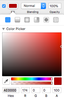
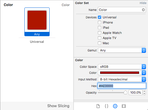
One such system of color organization — sRGB — is of particular interest for our purposes as it’s been a color specification industry standard for digital media for the past two decades. Whenever we encounter a hex color value such as #AE0000, it’s implicitly assumed that the value must be interpreted in sRGB color space (unless specified otherwise). Web browsers and image viewers usually assume sRGB for images that do not include any color profile.
CCI-P3 is a color space that includes all of sRGB and introduces more saturated reds and greens compared to sRGB. It has been widely adopted in consumer displays (in smartphones, tablets, and desktop computers) as well as in ultra-high definition television standards.
Over-saturation on wide-gamut displays
With the rapid adoption of P3 wide-gamut displays, Sketch users started noticing odd things happening with colors in their documents: reds and greens would look much more saturated on those P3 displays than on older Macs and regular sRGB displays. The reason for that is, Sketch was not color managed until version 48, and documents remain unmanaged by default even in newer versions.
Color values used in the documents are interpreted in the color space of the display which used to be considered “okay” as most displays’ color profiles resembled sRGB standard anyway (although of course, this has never been correct with regard to color reproduction).
The problem with interpreting a given value in a different color space is that it means a different visible color there. In case of displaying what was implicitly considered an sRGB value in P3 color space, Fueled red #AE0000 interpreted in P3 means a much more saturated color #BF0000 in sRGB. In general, different displays would represent the same color in Sketch differently because the display’s color profile would not be taken into account.
Some people have solved that issue by assigning their monitor’s sRGB profiles or switching the displays to sRGB mode where such option was available. The problem with this approach is that this is how the expensive professional-grade hardware no longer delivers the wide color range it’s built for. Not only that but the sRGB profile is not any device’s actual profile, so the colors will be guaranteed to be off, even though it solves the over-saturation problem.
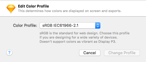
Fortunately, the correct solution is simple. Starting from version 48 Sketch is color-managed. Every document can now be assigned a color profile and the colors in the document are correctly translated from the color space of the profile to the color space of the display according to the display’s color profile to ensure faithful color reproduction (assuming the display’s color profile is correct).
The following table illustrates how #AE0000 color is affected by standard color transformations and what is actually seen on screen (assuming the color profiles are true to the monitor in question; which normally needs to be ensured by color calibration process).
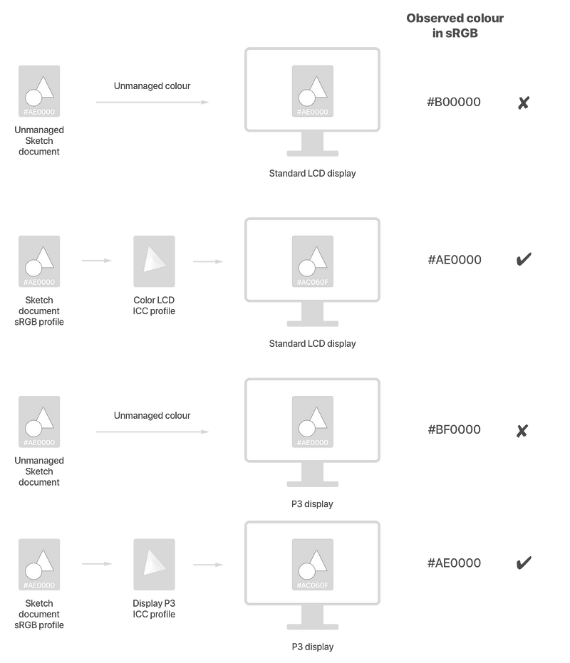
In both cases of unmanaged color, color values are sent to the display as they are in the document which means — assuming the displays’ accurate profiles are Color LCD and Display P3 — that the observed sRGB value can be derived from the input color value by applying a transformation from the monitor’s color space to sRGB (which is defined by the display’s color profile).
When color management is enabled, the color specified in the document is interpreted in the color space assigned to the document and display’s profile transformation is applied to that color before it’s displayed which results in a correct color on screen.
Again, if we apply the reverse display color profile transformation, we will get exactly the color specified in the Sketch file (in practice, if we use system eye-dropper or Digital Color Meter app to check the color, there may be a minute difference in hex values due to floating point calculation errors).
Should vibrant P3 colors be desired by the designer, the document should be assigned a P3 color profile in Sketch.
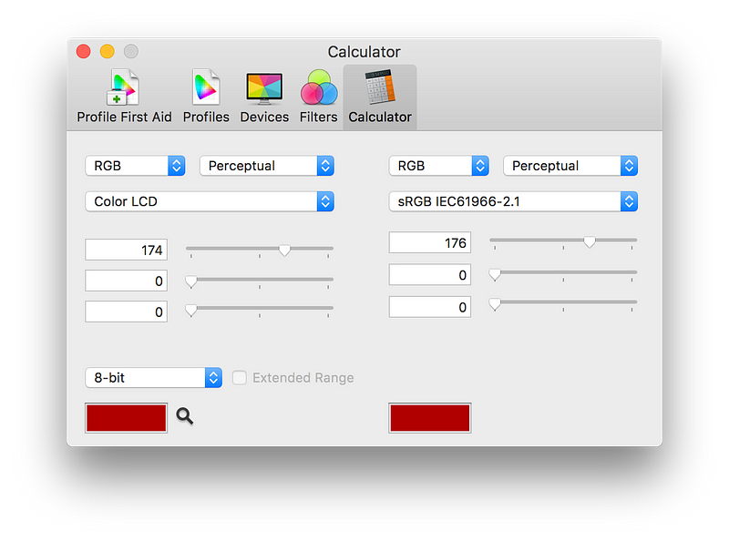
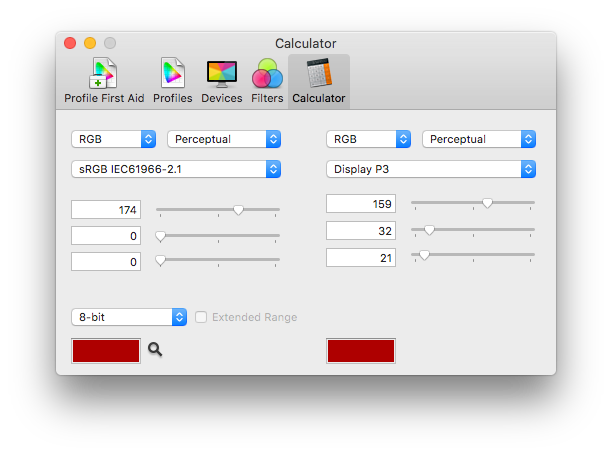
In this case, if predefined sRGB colors need to be used (e. g. brand colors from existing brand guidelines), their hex values must be converted to P3 to preserve perceived color unless particular brand guidelines prescribe otherwise (the same hexadecimal value might be favored over a correct color conversion or a new color altogether may be prescribed for wide color displays). Here’s how #AE0000 / srgb(174 0 0)could be converted to its P3 #9F2015 / p3(159 32 21) using Color Sync Utility’s Calculator that ships with macOS X.
Google can be used to perform hexadecimal ↔ decimal color format conversions: typing rgb(174, 0, 0) in the search field will yield #AE0000 and vice versa. Note how the digital representation is color-space agnostic, so you can use the converter for both sRGB and P3 values.
Design preview
Once color management is taken care of (including monitor calibration and viewing environment of course), we can hope for faithful representation of color we work within Sketch but there will still be a discrepancy between what is seen on the Mac and what is seen on the device. Part of it may be due to lack of calibration, part due to display settings like brightness (I am more likely to have my phone on max brightness than my laptop).
These are the reasons it’s always a good idea to review designs with Sketch Mirror. Our testing has revealed that Sketch mirror behaves correctly with regard to color management in all currently available configurations:
- Unmanaged Sketch documents will be displayed in sRGB (which is usually implicitly assumed) on both legacy iOS devices and newer wide-color ones (iPhone 7 and newer iPhones, iPad Pro 10″ and newer iPads).
- Color-managed Sketch documents will be displayed according to their assigned color profile and devices screen capabilities.
Verifying design execution
It’s not uncommon for an app developer, designer, or a QA specialist to take a screenshot of an app design in Sketch, put it next to a screenshot of an actual build of that app and wonder why the colors are different. Why indeed?
The problem may be manifold, and we will try to list what can go wrong, so it would be straightforward to check and rectify.
Picking and specifying a wrong color value at the development stage.
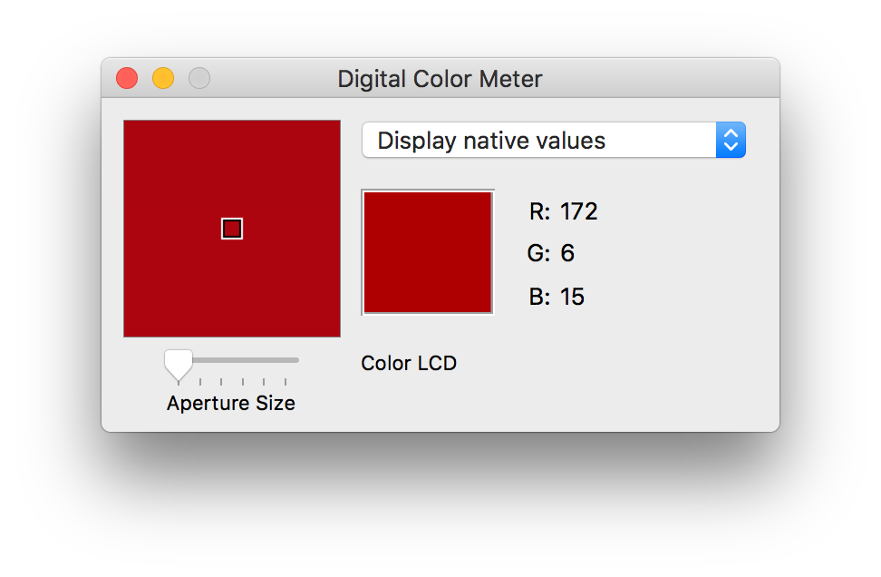
Developers often use screen color pickers (also known as eye-droppers) to pick a color from the design. Bad news is, even if the user knows what they are doing, eye-droppers will return incorrect colors in some circumstances.
How can color pickers be wrong?
These are the two main reasons why we never use color picker apps to collect colors from designs (be it in Sketch or Photoshop).
- Color value may be collected directly from the screen which is a representation of the color in a specific device’s color space. We can see in the figure above how this leads to a wrong value if we interpret it in sRGB (which we usually do): we miss an inverse transformation from the device color space to sRGB.
- Even if the collected color is transformed correctly back to sRGB, there may be additional floating point errors introduced by the reverse transformation process. This behavior has been observed on a P3 MacBook Pro with a standard P3 color profile using Apple’s Digital color meter set to display values converted to sRGB. A 2014 MacBook Pro with a standard Color LCD profile did not exhibit this behavior and the Color Meter app displayed correct sRGB values in my tests. The introduced errors may be insignificant and practically imperceptible but are still not desired when working for example with brand colors where preserving the exact hexadecimal value is considered important.
How to pick the best colors for app design?
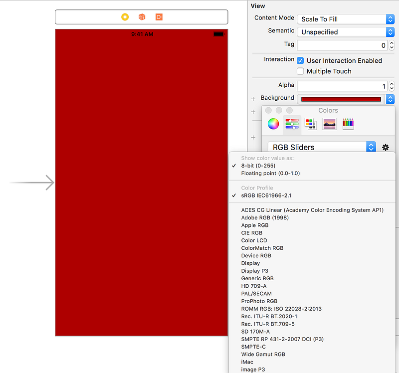
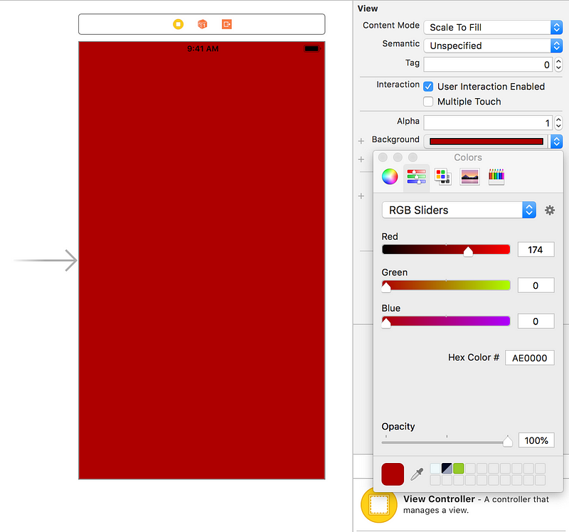
We cannot talk about accurate color reproduction in the builds if the colors in the design change based on the display the design is viewed on, like the difference between mobile and mobile-friendly design. Therefore the color space of the Sketch design document must be fixed by assigning the document a color profile. These days, it would typically be sRGB. Once this is done, the developer’s job is easy: Recognise design document’s color space using ⌘+Shift+K shortcut in Sketch.
Specifying the correct color space in Xcode
Now as we know the color space and the color’s RGB value, there are only 3 possibilities to specify a color in Xcode.
- In Storyboard – Apart from specifying the color hex value, we need to ensure the color space is also specified correctly by clicking on the little gear icon in the system color picker and selecting sRGB color profile as shown in the second screenshot. Note that the color space needs to be selected before we specify the color value, otherwise the RGB values will be converted to sRGB from the previously selected color space. So the process should look like this:
Select/confirm the color space.
Select/paste the RGB value.
It appears sRGB is the default profile these days but legacy projects used to use Device RGB placeholder which will result in completely different colors seen on iPhone 6 and iPhone 7. Here’s what to look for in existing projects’ storyboards. When the color is specified in sRGB, this storyboard source code will look like this:

In case of P3 color profile in Sketch, the same process applies to Display P3 color profile specified in Xcode.
- In asset catalog (iOS 11+) – Xcode 9 introduced named colors — a feature that allows to specify colors as named assets and specialize them depending on various device features including naturally screen color space. Those named colors can then be used from both storyboards and from code.
- In code – If Sketch color profile is sRGB, nothing needs to change whatsoever when creating UIColor objects, as those use so-called extended sRGB color space coincides with sRGB in 0–1 color component ranges, so the same values will result in the same colors on both all iPhone models. If the color space of the Sketch document is P3 and named colors cannot be used (say, if iOS 10 support is required), then developers need to resort to a new UIColor initializer init(displayP3Red: CGFloat, green: CGFloat, blue: CGFloat, alpha: CGFloat). Note that the old custom init(hex: Int)convenience initializers will not work correctly without modification of P3 color values.
How can I verify color accuracy for my design?
Now that we finally specified colors in the app, how do we visually verify the results against the designs? How do we avoid the confusion of seeing different colors? Naturally, the most practical way of quickly verifying color accuracy is by looking at a screenshot of the app side by with the design. This only works reliably under 2 conditions:
- The screenshot is taken from an iOS device unmodified (simulator works in case of sRGB colors but should generally not be considered reliable due to considerations below)
- The Sketch document is color-managed.
Once these conditions are met, both visual comparison and exact screen color comparison using an eye-dropper will be correct.
More precise verification methods include combining a Sketch export with an actual app screenshot in Photoshop as layers with Difference blending mode.
iOS Simulator screenshot considerations
Disclaimer: the following paragraph is a hypothesis verified only with a few experiments. The information in this section is not based on official documentation, can become outdated at any time without notice and cannot be relied upon.
It appears that iOS Simulator is not properly color managed: simulators appear to respect sRGB color values but colors in other color spaces seem to be converted to something like Generic RGB and assigned sRGB profile anyway in screenshots regardless of the simulated device type and the Mac screen used. This means that sRGB colors should look correct but P3 colors will be distorted and will look desaturated.
iOS device screenshot considerations
When we take a screenshot from an iOS device, the resulting image is assigned sRGB or P3 color profile depending on the device screen type. Note that this information can be lost if the screenshot is exported and sent by email or AirDrop (in which case the image will have sRGB color profile unconditionally). In order to get the screenshot unmodified, we can use Image Capture app or export the screenshot’s original from iCloud photo library on the Mac.
Summary
In order to make color to appear correct on developer/designer workstations and on iOS devices, we need to follow 2 simple rules:
- Color manage Sketch design documents.
- Specify colors in Xcode along with the color profile assigned to the Sketch design document.

