The Idea
barneys new york app developer
When Barneys shared with us that a significant portion of their traffic was coming from iPads, we quickly calculated the significant positive ROI we could expect from building a native app for this constituency while simultaneously burnishing Barneys’ reputation as a leader among luxury retailers in the digital world.
User Experience
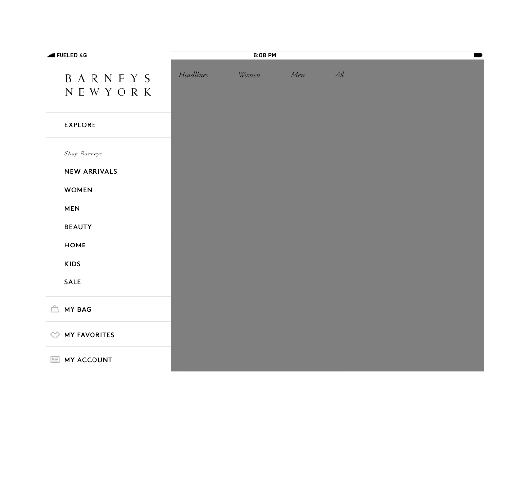
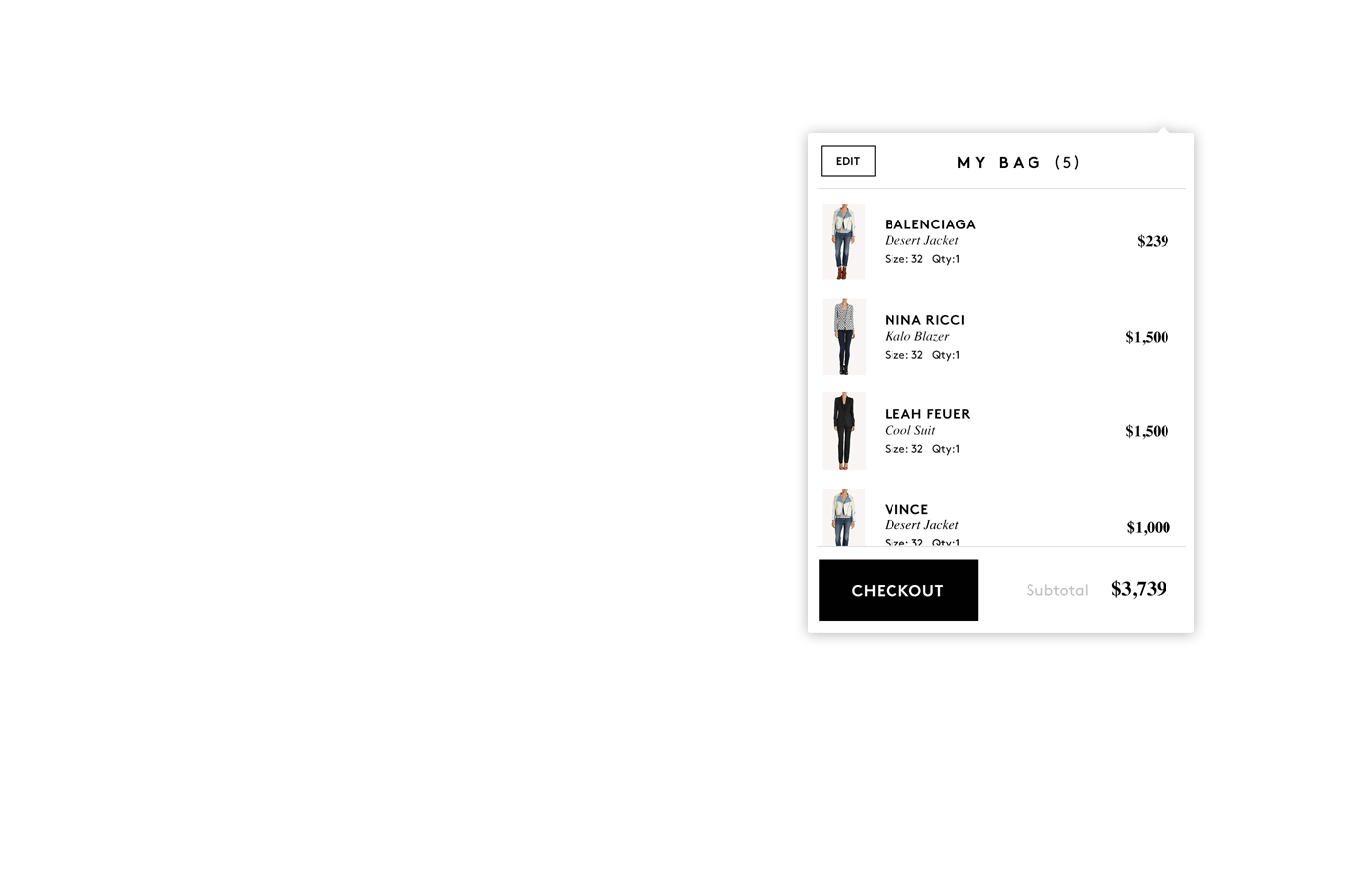
Barneys’ website is a blend of elevated content and a classic shopping interface. Fueled’s team worked to ensure these two integral components were translated into a tablet- suitable form factor. We created a menu and navigation system that allows users to easily shop a vast collection of items without being overwhelmed or feeling lost, while maintaining familiar design cues from Barneys’ existing web experience.
Design

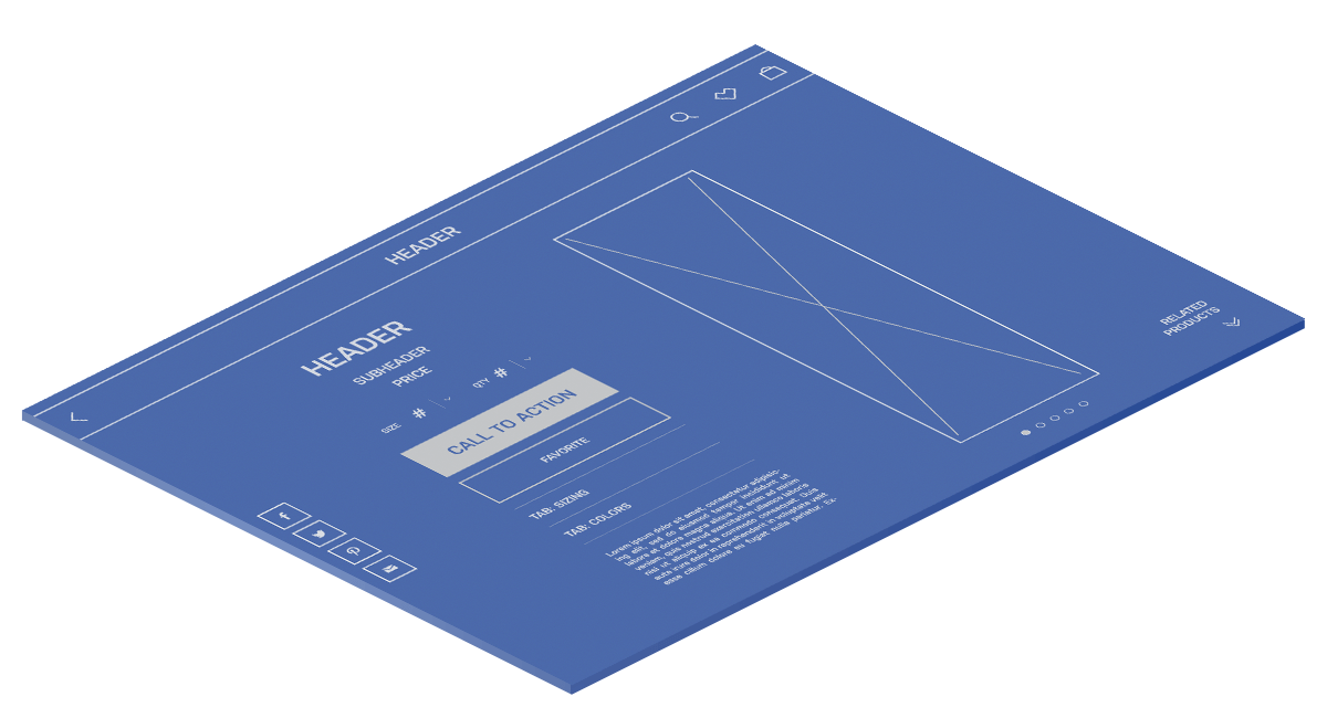
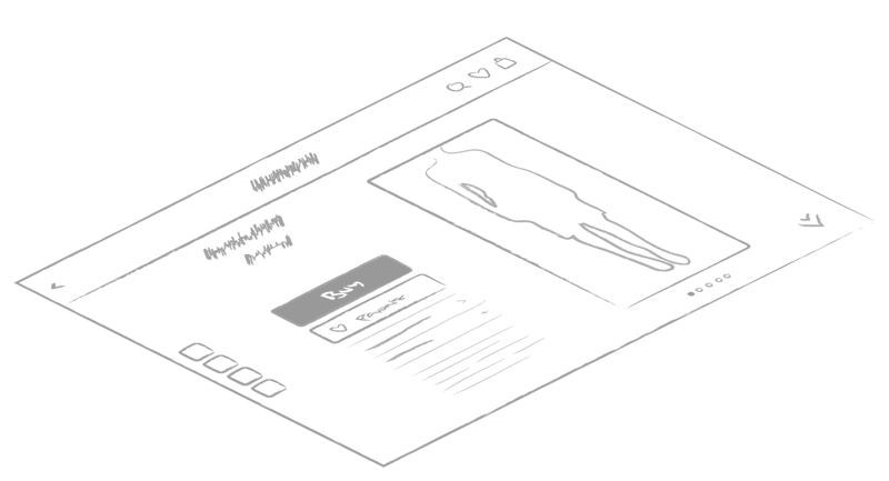
Bringing it together
Barneys was founded in 1923. Translating a nearly hundred-year-old brand to the iPad required careful consideration by, and coordination between, Fueled’s mobile designers and Barneys’ brand guardians.
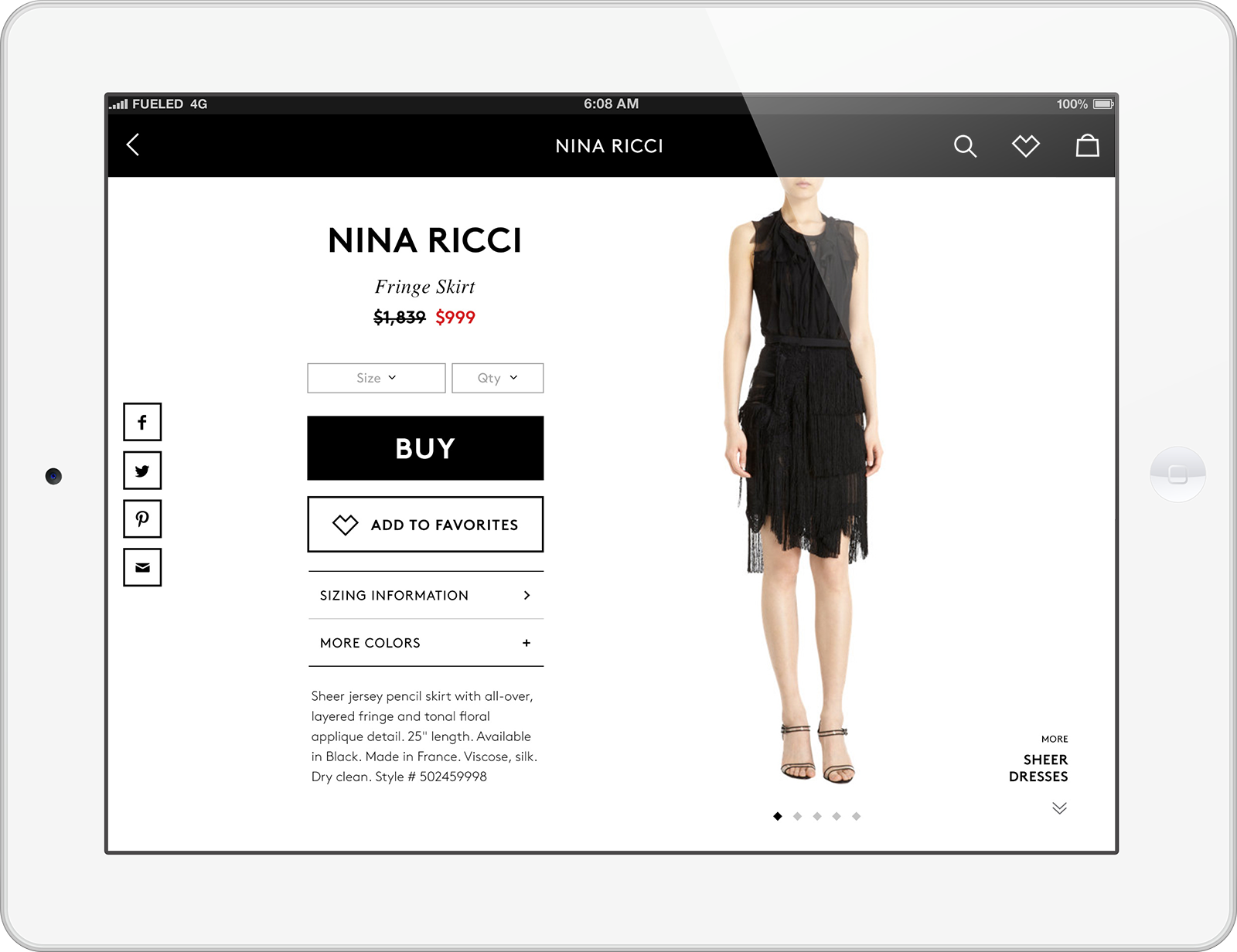
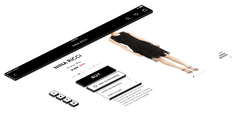
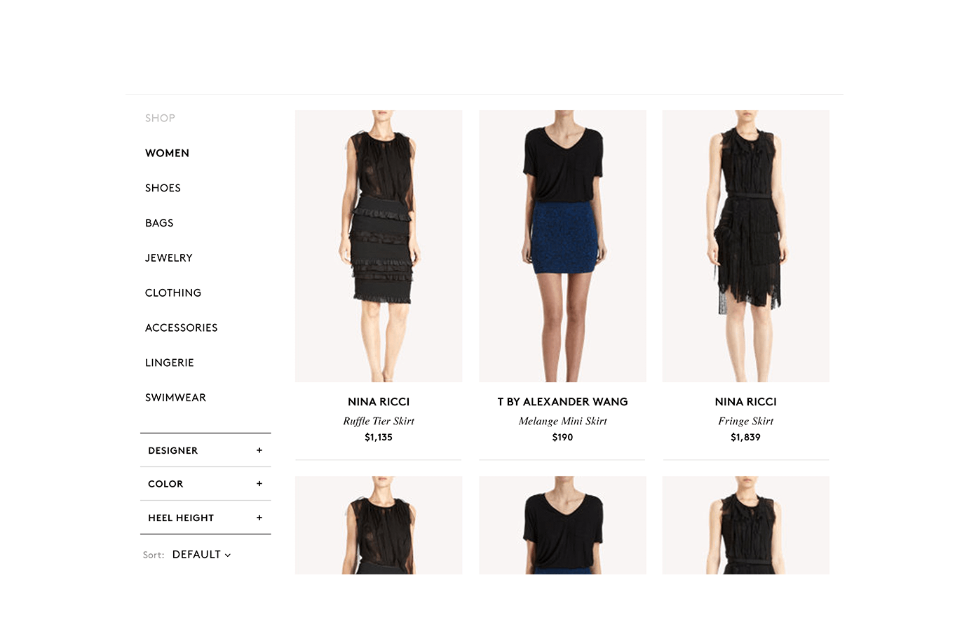
Ultimately, we crafted a clean, modern-looking interface that balanced familiar iOS design elements and standards with a uniquely Barneys look and feel.


Tailor Made
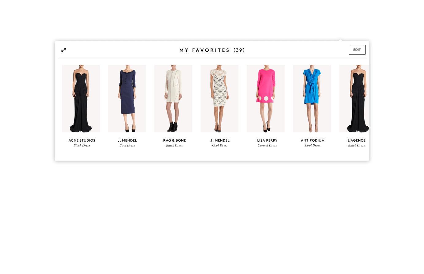
The app’s interface lets the iPad’s large display and touch-based interface shine, allowing users to swipe through appealing, large images of clothing.
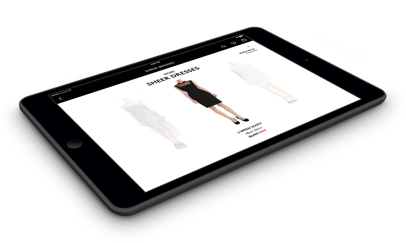
The Window
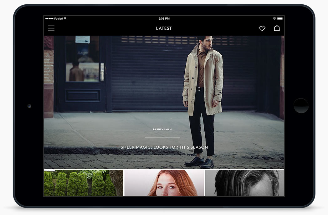

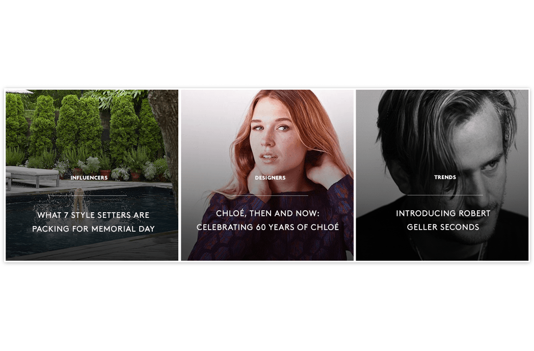
No Barneys app would be complete without their signature content property, The Window. It was particularly important create the interface in a way that was compatible with content already created for The Window’s web interface so that content managers wouldn’t have to do everything twice when uploading new images.
