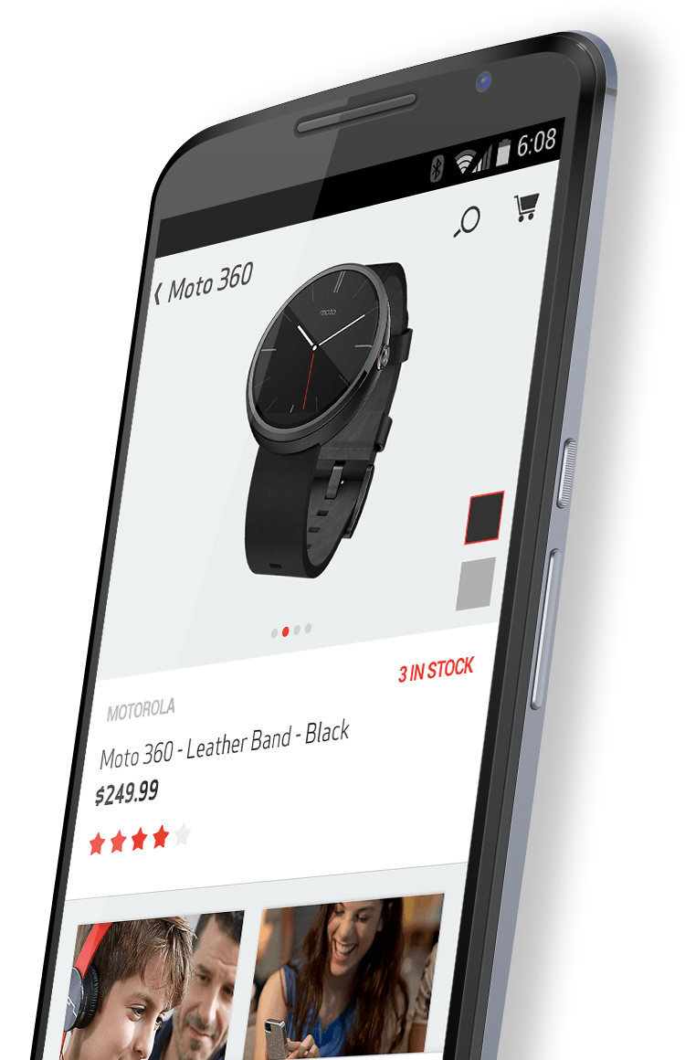
With over 130 million subscribers, Verizon is the largest wireless telecommunications provider in the United States. With their existing app showing its age, they engaged Fueled to upgrade and modernize their flagship mobile experience. We worked with them to design an innovative in-store experience that allows customers to interact with products and discover exclusive content as they pass through special Bluetooth Low Energy (BLE) zones within the store.
Working with iBeacons
verizon app developer
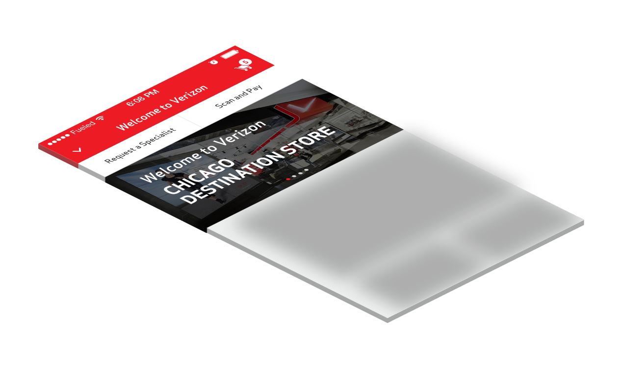
Creating an in-store experience that seamlessly bridges the retail store with the Verizon app is what makes this project unique. By defining “lifestyle zones” that pair to an iBeacon bluetooth unit, customers are able to view special in-app digital content relating to products immediately next to them in the store.
User Experience
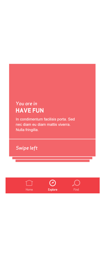
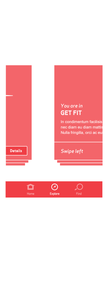
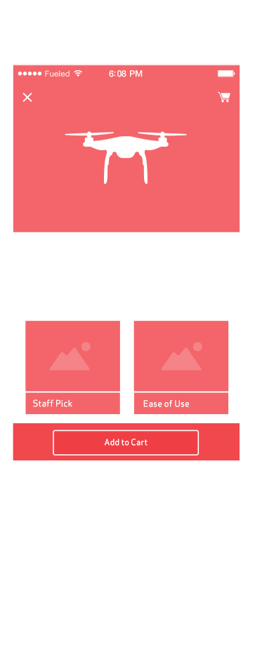
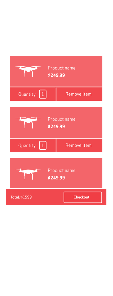
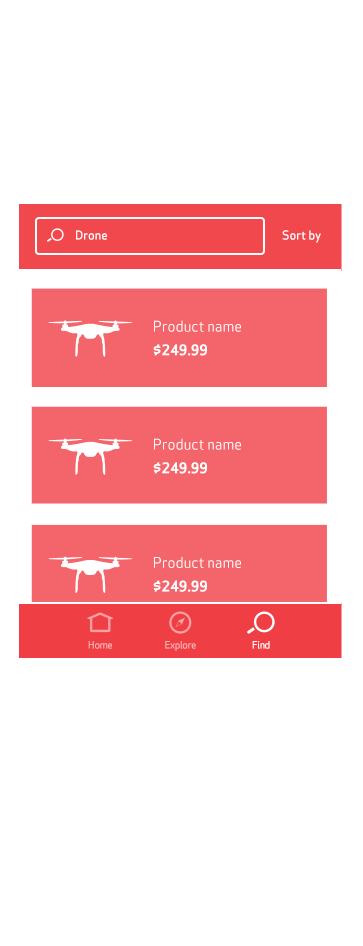
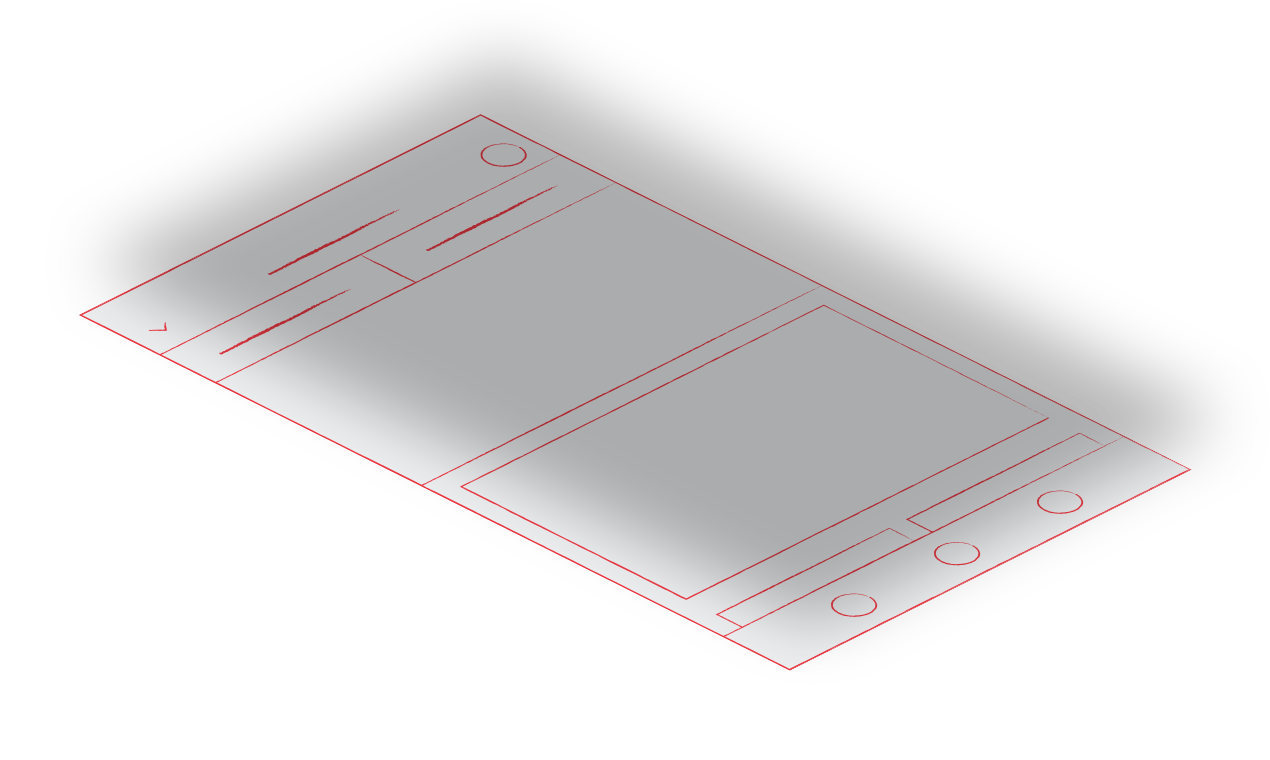
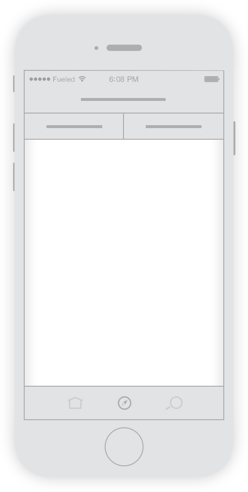
We left no stone unturned in our effort to create a truly modern, forward-thinking product. Fueled’s product & design teams sketched out a series of ideas, which eventually evolved into a set of wireframes based around the idea of “cards”. This route fit with the need for quick, digestible tidbits of content while browsing a store.


App Design & Features

Lifestyle Zones
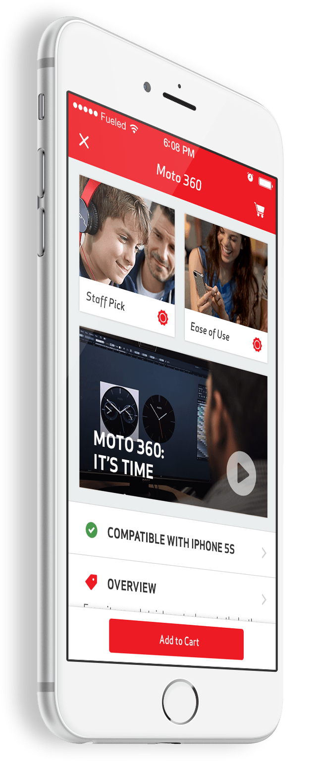
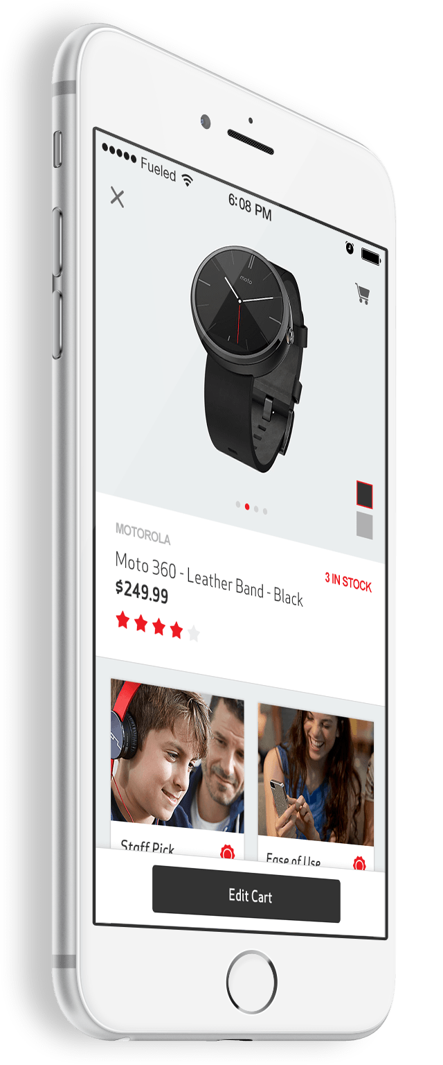
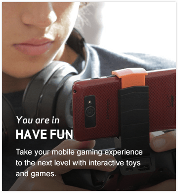
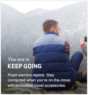
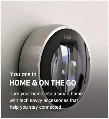
Verizon’s Lifestyle Zones are hubs of products tied to particular use cases, like working out or viewing digital media. We sought to create digital incarnations of those zones that automatically pop up on device as users walk into various LIfestyle Zones. These digital versions include products beyond what’s available in-store as well as videos, tips, and reviews for products. It was important to us that the digital features enhance rather than duplicate in-store capabilities.


Multi-Platform
When we first started, the My Verizon Mobile apps already had millions of existing users across iOS and Android. Naturally, with a client base this big, we designed the product for both iOS and Android platforms. Ensuring a synonymous experience between both was a must to allow a smooth cohesion for everyone shopping in store.
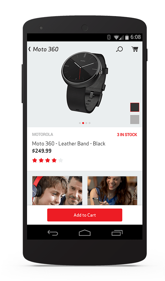
Android
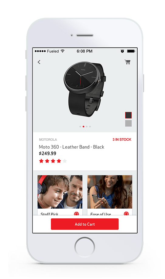
iOS
Indoor Positioning & Store Maps
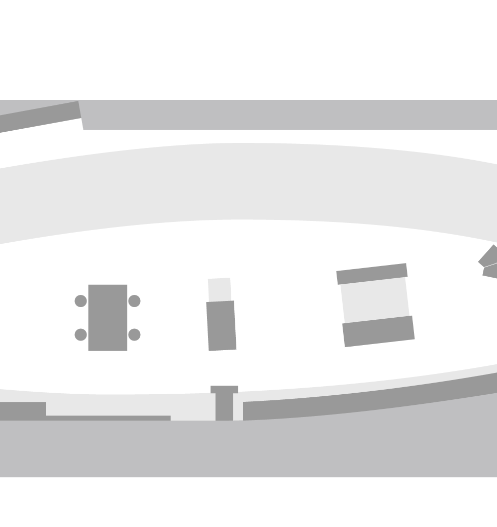
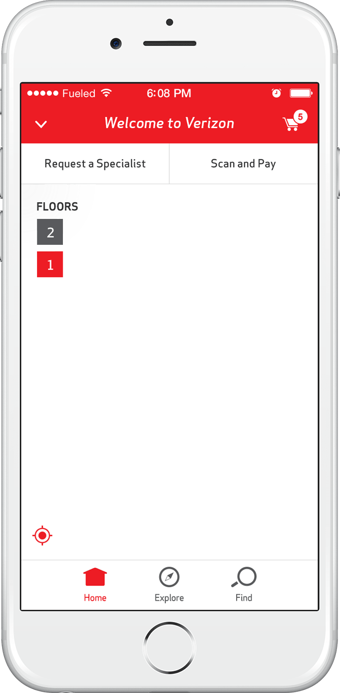
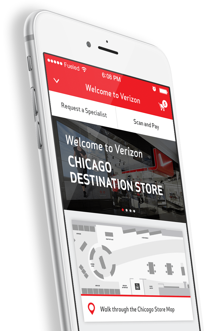
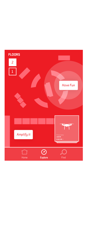
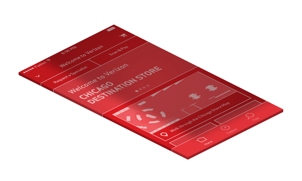
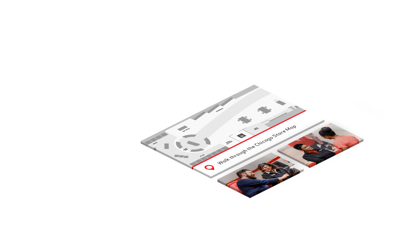
We co-developed new in-store mapping capabilities, allowing users to navigate around Verizon stores and easily find exactly what they’re looking for with an interface familiar to anyone who has used their phone’s map app. This incredible new feature launched alongside large new flagship stores in Chicago, Houston and Minnesota's Mall of America.
