
Sweetgreen is on a mission to “build healthier communities by connecting people to real food.” They have locations in most major cities and primarily sell fresh salads and harvest bowls. They are one of Fueled’s personal favorite quick and easy lunch options and have a well developed app that makes the ordering process easier. Thats why we decided to take a look at their app this month to see how we could improve its user experience.
What works well
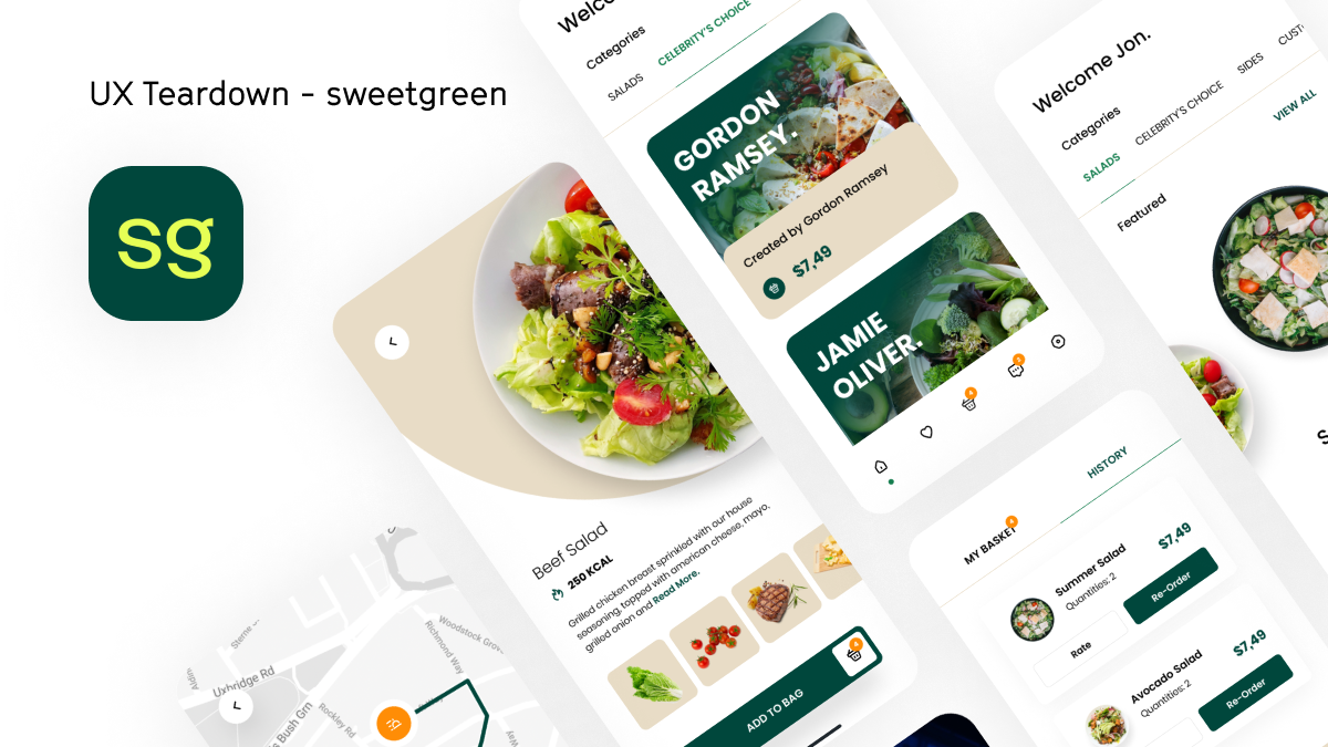
The visual identity of the app is clean and friendly, with a fresh aesthetic and appealing balance of illustrations, photography, and animations. The app has a polished feel, featuring great speed and consistent performance. We’re not surprised this app has 4.9 stars and 95K ratings in the App Store, considering it offers a delightful user experience overall. The app intelligently personalizes your experience depending on location and past orders; efficiency we especially appreciate when trying to grab lunch in the middle of a busy day. Reordering is a breeze, and, in our experience, delivery has always been on time and easily trackable. Sweetgreen often solicits feedback in the app, which makes customers feel like they are being heard.
What could use improvement

The app has a unique feature that allows the user to sync the nutritional information of your meal with Apple HealthKit. We love how ambitious the integration is, however, the feature seems to be broken since the synced values seemed strikingly inaccurate. We hope they fix it soon!
Once minor change is we don’t love that the app ha an order minimum of $10 while most of their bowls are $9.99. We ended up feeling coerced into adding ingredients just to meet the minimum cost, which added a twinge of frustration to an otherwise lovely experience.
“Fueled twists” Our feature/ roadmap ideas

The app is well designed and is developed with user experience in mind first, which is the reason we don’t actually have that many complaints about the app. There is of course slight tweaks we would make to the design, such as improving the product selection screen to draw a bigger emphasis on the product photo, but one aspect we would draw more attention to is the editorial content the app provides. The app showcases custom bowls designed by celebrities and athletes, but it’s mixed into the order menu so you only see it if you choose to browse. The app should decouple those sections, so even if a user thinks they want to reorder their usual meal they have a chance to see what seasonal items are being offered.
Overall, there is a reason why the app has a 4.9 in the app store with almost 100k ratings. However, we always see that there is room for improvement and think that these small details could push the app to a 5 star app.
But enough about other people’s apps.

